Articles | Photoshop blog | Photography blog | about me | e-mail

Helen Bradley - MS Office Tips, Tricks and Tutorials

I'm a lifestyle journalist and I've been writing about office productivity software for a long time. Here you'll find handy hints, tips, tricks, techniques and tutorials on using software as diverse as Excel, Word, PowerPoint, Outlook, Access and Publisher from Microsoft and other applications that I love. My publishing credits include PC Magazine, Windows XP mag, CNet, PC User mag, SmallbusinessComputing.com, Winplanet and Sydney Morning Herald.

Friday, June 19, 2009

Cool excel printing options

Excel offers some cool options for printing worksheets. Here are six of my favorite techniques:

1 Printing grid lines (or not)


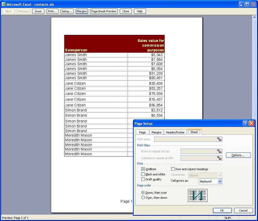
To print grid lines on your final printout, choose File, Page Setup, Sheet tab and enable the Gridlines checkbox. This prints horizontal and vertical lines much like you see on the screen in editing view.

2 Printing row and column headings


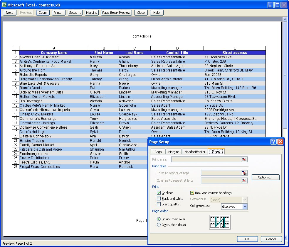
To print the letters A, B, C etc above the columns on your worksheet and the row numbers choose File, Page Setup, Sheet tab and enable the Row and column headings checkbox. This works particularly well when combined with printing Gridlines but can be used without gridlines too.

3 Setting your own page margins


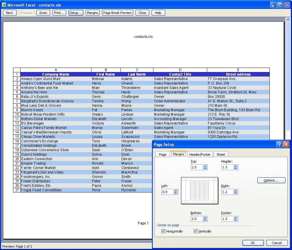
You can configure the margins around the page by choosing File, Page Setup, Margins tab. Set the margin values and use the Horizontal and/or Vertical checkboxes to centre a small worksheet on a larger page.

4 Drag a margin into place


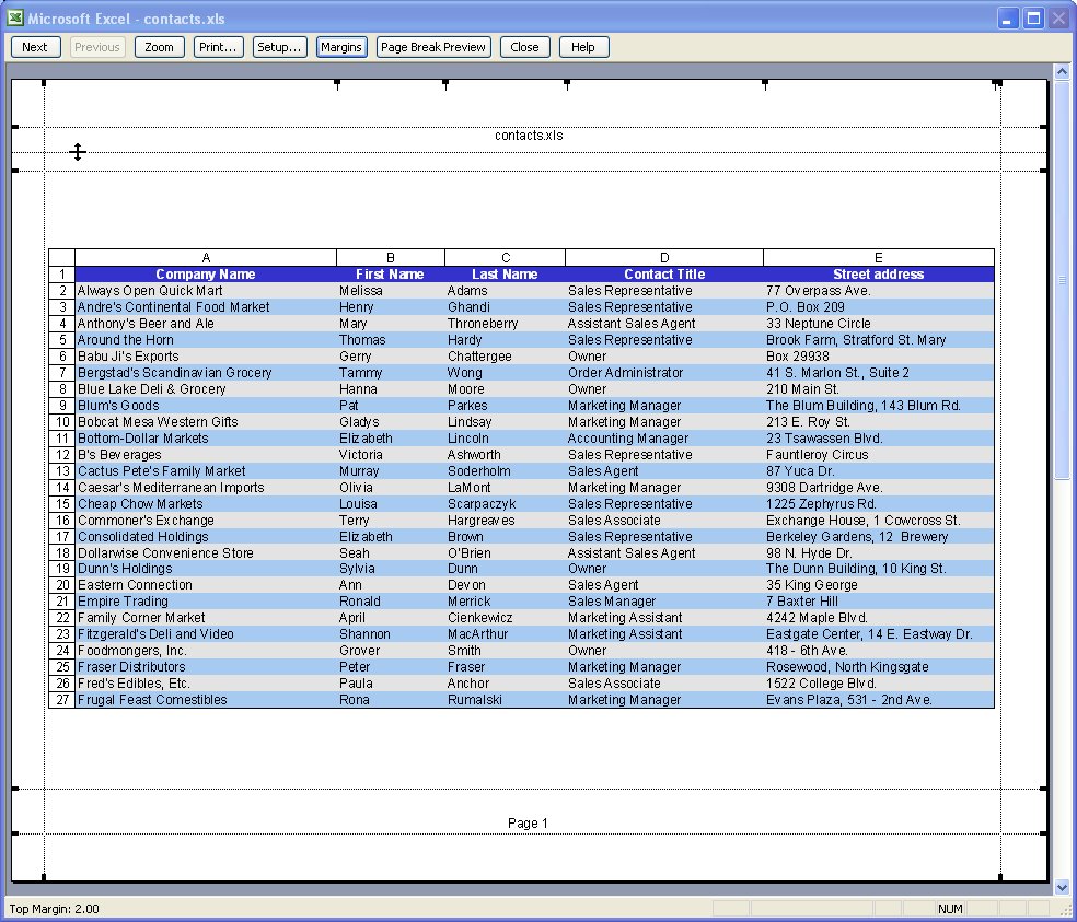
You can also control margins from the Print Preview screen. Click Margins to turn the margin indicators on. You can now move these into new positions by simply dragging on them.

5 Select an area to print


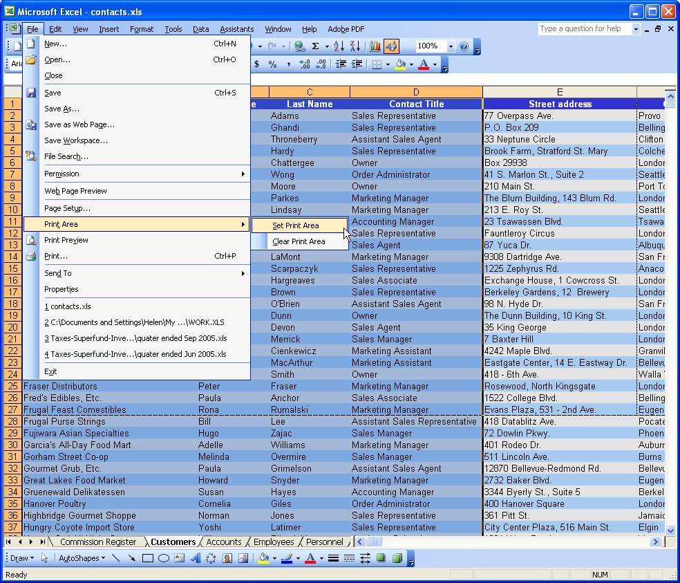
When a print area is set, this will print by default regardless of how big the worksheet is. Drag over the area to use and choose File, Print Area, Set Print Area to configure it. To clear the print area, so you can print the entire worksheet, choose File, Print Area, Clear Print Area.
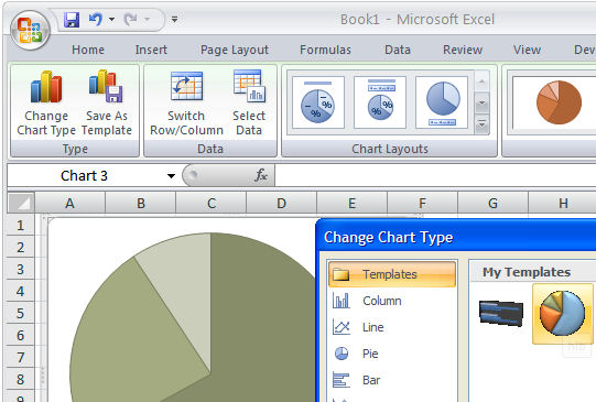
6 Print a chart


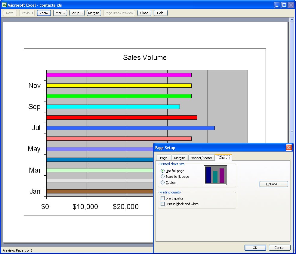
When you click a chart on a worksheet to select it and choose File, Page Setup, the page setup dialog shows no longer contains the Sheet tab and, instead, contains a Chart tab. This shows options for sizing and printing charts. When you click Print, only the chart will print.

Labels: , , , , ,

Add to Technorati Favorites

Tuesday, June 9, 2009

Multi colored Excel charts


It isn't always the case that you want to chart multiple series of data on a single chart. Sometimes you only have a single series and Excel, by default, plots all the bars or columns so they are colored identically. Boring!

Luckily, in Excel 2007 a solution is at hand. Simply select and right click the series and choose Format Data Series > Fill > Vary Colors by Point. Excel colors each bar a different color. Best of all, the colors are linked to themes so you can change the colors by changing the Theme - the theme tools are on the Page Layout tab.

So, no more boring single color charts - ever - please!

Labels: , , ,

Add to Technorati Favorites

Friday, May 22, 2009

Excel - print charts in black and white


Although your Excel chart might look great in color on the screen, if you're printing to black and white or printing in color and planning to reproduce the charts in black and white you might be disappointed with the final result. Light green, light blue and light orange all look very different on the screen but are indistinguishable in black and white.

So, when your chart is destined for reproduction in black and white, set it up so it is guaranteed to be readible. To do this, select each series or data point by clicking on it, right click and choose Format Data Series (or Format Data Point)> Patterns tab > Fill Effects > Pattern and use a grey or a black and white pattern. Repeat for all the series and save before printing. The chart is guaranteed to look good when printed.

Labels: , ,

Add to Technorati Favorites

Wednesday, July 16, 2008

Widening chart columns in Excel 2007

Colour me stupid. I am reeling from having single handedly wiped out all the images from my blogs - yep! 2 of them decimated by my stupidity. I'm now resorting to begging friends, family, neighbours and anyone I meet (ok I'm exaggerating, but I am desperate), to spend time helping me put it all back together. I have the images, they just aren't on my server any more and my computers and Blogger have this love hate relationship, the more frustrated I get with how slow the connection is the slower they go - see! they say, if you think that was slow, try this.. seriously it is hours of work to get this all back. Hence no delicious new posts.

This happened over two weeks ago so I'm slowly resigning myself to putting it back over time, so here's today's tip - no image - sheesh - don't talk to me about images!

To make the column widths on an Excel 2007 chart wider - or narrower if you think they aren't awful enough when you have long X-axis values, right click a column choose Format Data Series. From the Series Options selection drag the Gap Width value close to the No Gap end of the slider for a larger column and the other direction for a smaller one. This increases the column width by decreasing the gap between the columns. Click Close and you're done.

Now, back to uploading images one by one .. hell, even Noah got them in two by two!

Labels: , , ,

Add to Technorati Favorites

Thursday, October 25, 2007

Plotting little and big data


Disaster will strike your Excel charts if you try to plot very large data values and very small values on the one chart. You'll see the big values but the little ones will blend into the x-axis of the chart so you won't even see them.

To include both sets of data on the one chart, add a second axis and plot the smaller values against it. Now you'll be able to see them alongside the very large values.

To add your second axis, select the chart, select the series you can't see (click on one you can see and use the tab key to move until you have it selected). Right click and choose Format Data Series. Select Series Options, Secondary Y Axis. With the data series that should be plotted against the secondary axis still selected, right click and choose Change Series Chart Type and select a different chart type such as Line.

Labels: , ,

Add to Technorati Favorites

Tuesday, May 8, 2007

Text on a chart, Excel


It's easy enought to place a title or Y and X axis titles on a chart but what about a note or comment?


The secret is in the Drawing tools. Display the Drawing toolbar and click on the Text Box button. Now you can drag a text box on your chart and add text inside it. Size it, format it and you're off.


Labels: , ,

Add to Technorati Favorites

Friday, May 4, 2007

Reuse a Chart's "Look"


Sometimes you'll create a chart that just looks so good you want to save the 'look' so you can use it again. You can do this by turning your chart into a template. This would be a technique you could use if you were creating a report and you need to use multiple charts that are all formatted in a similar way.


To save a chart as a template, first display or create the chart and select it. On the Chart Tools, Design tab, choose Save As Template in the Type group. In the Save In box check you're using the Charts folder and type a name for your template and click Save. Later, to apply the template, to a chart you're about to create, select your data the Insert tab, click the Other Charts button to open the list and choose All Chart Types. Choose Templates and then the template you just saved. If you already have a chart created, click the chart and click the Design tab, then Change Chart Type. Click Templates, then click the template to use from the My Templates area.


You can store lots of templates to meet any need you might have and change from one to the other as required.

Labels: , ,

Add to Technorati Favorites

Saturday, March 31, 2007

Data labels on Excel charts


Data labels on your charts show your viewer the values they're looking at and after all - isn't that the purpose of the chart?

To add Data Labels to a chart, click the chart and choose Chart, Chart Options. Click the Data Labels tab and choose a style that will look good on your chart. Typically values is a good choice but, for pie charts, for example, a different type might work better.


Labels: , ,

Add to Technorati Favorites

Friday, February 16, 2007

Excel 2003 lists

Excel 2003 offered a cool new tool for managing data that was in a list format. It made Excel the place of choice for small lists and it simplified the process of charting list data - Excel lists expanded automatically to allow for more data to be entered and charts based on the list data automatically expanded to include the new data - wonderful!

Here's how to work with lists in Excel:
  1. Turn an existing table of data into a list by clicking on a cell in the range and choose Data, List, Create List. If your list has a heading row, enable the My list has headers checkbox and click Ok. Notice the border around the list.

  2. To add a row, click in the list area and click in the last (Insert) row which has an asterisk in its first cell. It is also possible to add a row in the middle of the list by clicking where the row should appear and choose List, Insert, Row.

  3. When data is created as a list, the AutoFilter feature is enabled. To sort data in the list, click the dropdown arrow to the right of the column (field) to sort on and choose Sort Ascending or Sort Descending as required. To sort on multiple columns, use the Data, Sort dialog.

  4. To create a complex filter for your list, click the Custom option from the dropdown list for the field that you want to create the query on. Set the tests to use and select And or Or depending on what information you need to extract. Click Ok to view the results. To display all records again, choose Data, Filter, Show All.

  5. When you create a chart based on list data it will be automatically updated when you add a new item to the list. To create your chart, click in the list and click the Chart Wizard button on the new List toolbar and proceed through the Wizard as you would for any other chart.

  6. To perform calculations on list data use the Toggle Total Row button. This adds a total row to the list and totals the right most column. To disable this total or create another one, click the down pointing arrow to the right of the total and choose None or a different calculation. Each column has its own down pointing arrow from which you can select the calculation to be made on that column's data.

Labels: , , , ,

Add to Technorati Favorites