Multi colored Excel charts
It isn't always the case that you want to chart multiple series of data on a single chart. Sometimes you only have a single series and Excel, by default, plots all the bars or columns so they are colored identically. Boring!
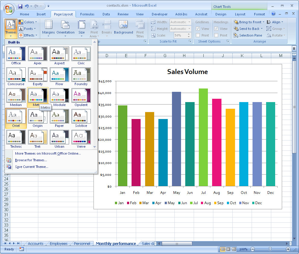
Luckily, in Excel 2007 a solution is at hand. Simply select and right click the series and choose Format Data Series > Fill > Vary Colors by Point. Excel colors each bar a different color. Best of all, the colors are linked to themes so you can change the colors by changing the Theme - the theme tools are on the Page Layout tab.
So, no more boring single color charts - ever - please!
Labels: chart, Excel 2007, multicolored, series
posted by Projectwoman @ 10:19 PM
0 Comments
-
Links to this post
![]()
![]()

