Widening chart columns in Excel 2007
Colour me stupid. I am reeling from having single handedly wiped out all the images from my blogs - yep! 2 of them decimated by my stupidity. I'm now resorting to begging friends, family, neighbours and anyone I meet (ok I'm exaggerating, but I am desperate), to spend time helping me put it all back together. I have the images, they just aren't on my server any more and my computers and Blogger have this love hate relationship, the more frustrated I get with how slow the connection is the slower they go - see! they say, if you think that was slow, try this.. seriously it is hours of work to get this all back. Hence no delicious new posts.
This happened over two weeks ago so I'm slowly resigning myself to putting it back over time, so here's today's tip - no image - sheesh - don't talk to me about images!
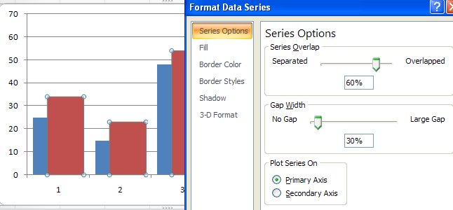
To make the column widths on an Excel 2007 chart wider - or narrower if you think they aren't awful enough when you have long X-axis values, right click a column choose Format Data Series. From the Series Options selection drag the Gap Width value close to the No Gap end of the slider for a larger column and the other direction for a smaller one. This increases the column width by decreasing the gap between the columns. Click Close and you're done.
Now, back to uploading images one by one .. hell, even Noah got them in two by two!
Labels: chart, column widths, Excel 2007, gap width
posted by Projectwoman @ 8:52 PM
0 Comments
-
Links to this post
![]()
![]()