

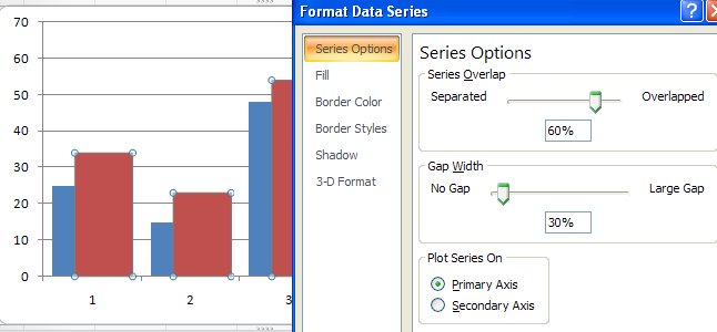
Sometimes an Excel chart will look better if your series overlap – this might be the case when you are comparing data from two years and where you want to show how the values have increased from one year to the next.
To make your series overlap in Excel 2007, select one series, right click and choose Format Data Series. Click the Series Options and decrease the Gap Width (it closes the chart up nicely) and incease the Series Overlap. Set the Series Overlap to around 60% and the Gap Width to around 30% for a good result. This is particularly useful when you are using images in place of colors for the bars of your chart but works in almost any situation.
I have so many columns in a column chart. I would like to split it into two pages with the horizontal lines exactly the same so when printed I can join them together.
Can you help?