Plotting little and big data
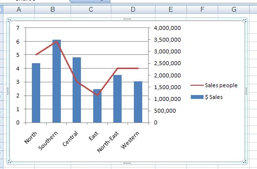
Disaster will strike your Excel charts if you try to plot very large data values and very small values on the one chart. You'll see the big values but the little ones will blend into the x-axis of the chart so you won't even see them.
To include both sets of data on the one chart, add a second axis and plot the smaller values against it. Now you'll be able to see them alongside the very large values.
To add your second axis, select the chart, select the series you can't see (click on one you can see and use the tab key to move until you have it selected). Right click and choose Format Data Series. Select Series Options, Secondary Y Axis. With the data series that should be plotted against the secondary axis still selected, right click and choose Change Series Chart Type and select a different chart type such as Line.
Labels: chart, Excel 2007, secondary axis
posted by Projectwoman @ 9:01 PM
0 Comments
-
Links to this post
![]()
![]()

