Articles | Photography Blog | Office Tips Blog | about me | e-mail

Helen Bradley - Photoshop and Lightroom tips and techniques

I'm Helen Bradley - I'm a photographer and Photoshop professional. In this Photoshop and Lightroom blog you will find powerful Photoshop and Lightroom tips, tricks and techniques that will help you get more out of both programs. You will also find step by step guides for working creatively with your photos in Lightroom and Photoshop and any other cool applications I know you will be interested in knowing more about.

Sunday, December 27, 2009

Sharpening in Lightroom


When you’ve finished doing your basic color correction to an image in Lightroom you’re ready to look into sharpening the image. In a previous posts I explained the basics of sharpening and how to use the High Pass Filter in Photoshop to sharpen an image. Today I’ll show you how to sharpen in Lightroom.

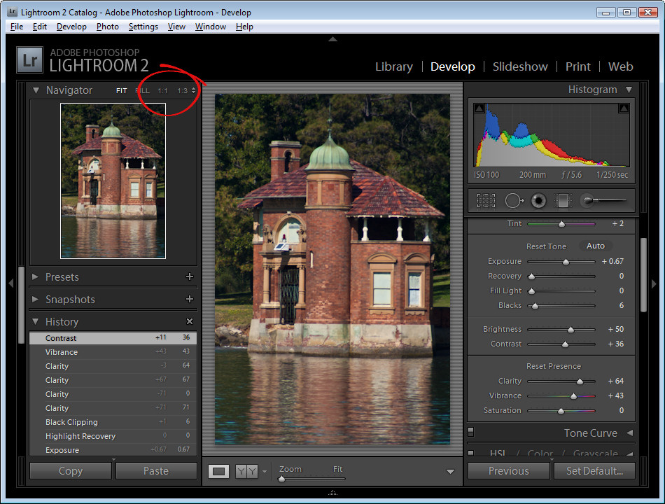
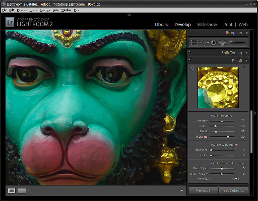
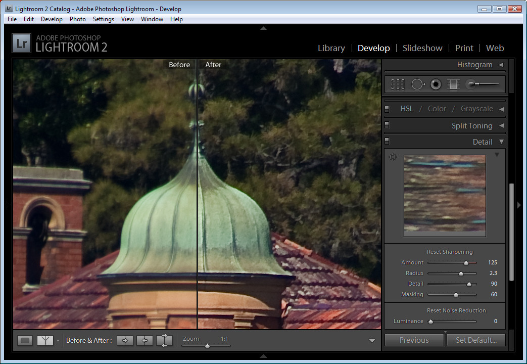
You’ll find the sharpening tools in the Detail area in the Lightroom Develop module. It’s best to work on the image at a 1:1 ratio as this ensures that the sliders that you’ll use can be seen at work on the image. If you aren't in at least 1:1 view you will have to work from the small preview window. To select 1:1 zoom, click the indicator in the top left of the screen.


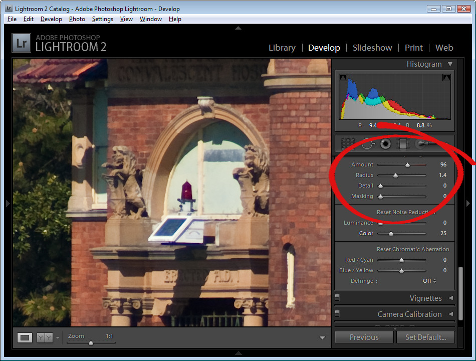
You have four sliders in the sharpening area. Amount controls how much sharpening is applied to the image. This can be considered to be your fine-tuning tool.

The Radius is one of the key settings to use. The Radius value can be moved between 0.5 and 3. Typically, a good Radius to start sharpening with is around 0.5 to 1 and then adjust it from there if the sharpening is insufficient. Images with large areas that are not very detailed such as portraits, may need larger values for the radius where images with a lot of fine detail may respond better to smaller values.


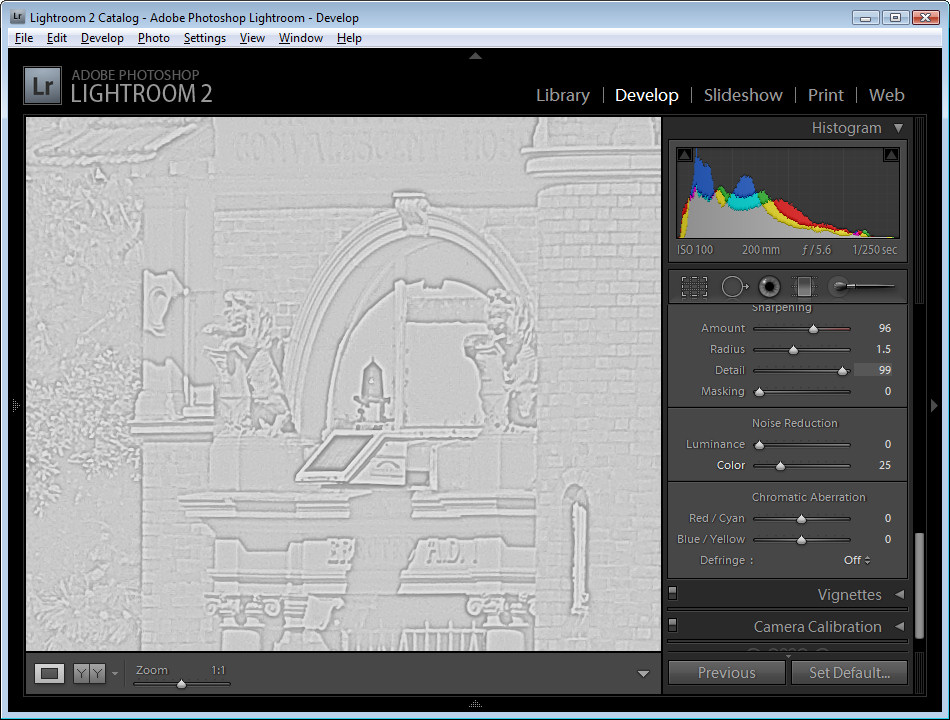
The Detail slider reduces the haloing in the image. The higher the value you use for Detail, the more halos you will see around the edges in the image. The lower the Detail value the less halo effect and the smoother the result.

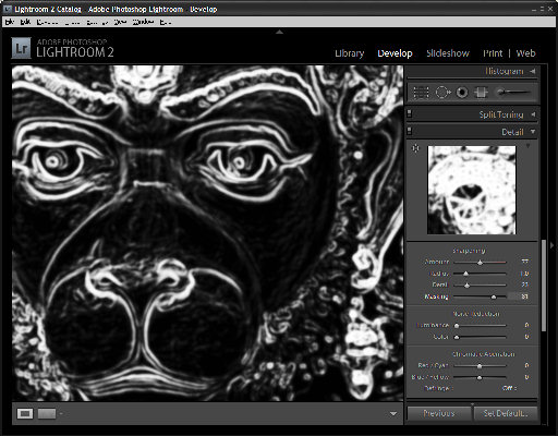
You can see how the slider works when you are viewing a 1:1 preview size. Hold the Alt or Option key as you drag on a slider. The higher the Detail value the more lines you will see in the grayscale preview indicting the sharpening effect on the image.

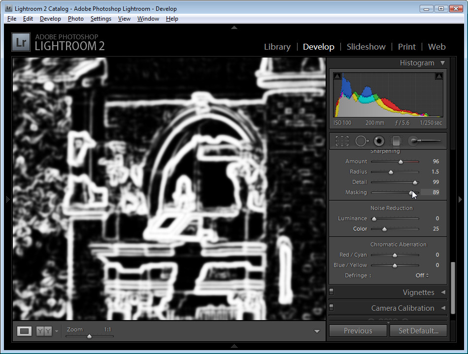
The Masking slider works to mask out areas of smooth color. What it does is to enhance the edges and remove the sharpening effect from areas in the image that have smoother color transitions which you probably don't want to be sharpened.

Again, you can hold the Alt key as you work with the slider. The slider values range from 0 – 100. At zero, everything in the image is sharpened and at 100 only the edges are sharpened. In the preview, the white areas are those being sharpened and those that are black will not be sharpened.


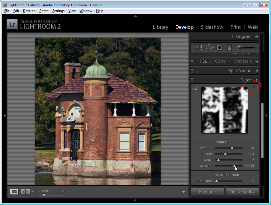
If you aren't using 1:1 view you will need the preview window to be visible so you can see the results when using the Masking and Detail preview options. To view this, click the arrow in the top right corner of the Detail area.


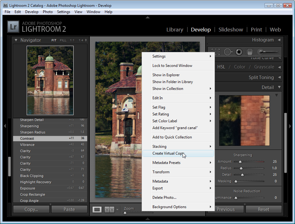
When you’re starting out learning how to sharpen it can be difficult to see just what effect the sharpening is having on the image. If you press the backslash key you’ll return to the unedited image rather than to the image as it was before you started sharpening it.

This is a time where virtual copies can be useful. Wind back the history to just before you started sharpening the image. Right click the image and choose Create Virtual Copy. This creates a virtual copy of the image whose starting history is the current view of the image after your initial fixes have been made.


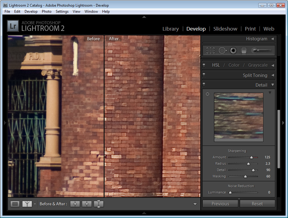
Now when you sharpen the image and use the Before and After settings you can see the change that the sharpening is applying to the image because that’s the only change to the virtual copy that you are editing.


Typically, if you are displaying images on the web you want to sharpen the image so that what you’re seeing on the screen is what you want to see when the image is on the web. On the other hand, for printing you generally apply heavier sharpening to the image as some of this will be lost in the printing process.

Labels: , , ,

Saturday, July 04, 2009

Photoshop Creative: Make a Collage Photo Banner


When you’re creating a photo blog or website a photo banner lets you showcase a range of your work. You can create a collage of photos for a banner in Photoshop or Photoshop Elements very easily. Here's how


Step 1
Start with a new image the size of your banner or a multiple of it. So, for example, if your banner is going to be 1200 pixels wide by 250 pixels you can start with this size image or double it so you have a bigger space to work and size it down as the last step.

Here I've created a document 2400 x 500 at a Resolution of 72 pixels/inch, RGB Color and with a Transparent background..


Step 2
Open the photos to work with. These should be fixed and color corrected but they don't need to be sized. I like to open more images than I will use so I have lots to choose from. A combination of close-ups and distance shots gives your banner a lot of variety. Flatten all the images to a single layer.

Select the Rectangular Marquee tool and drag over an area to use from the first photo. Select a generous portion of the image allowing plenty of room to the left and right of the main portion of the image that you are interested in as you will use this area to blend the layers. Chose Edit > Copy and then switch to the banner image and choose Edit > Paste. Close the original image.

Press Ctrl + T and then Ctrl + 0 and size the image to fit your banner. Use the Move tool to position it in place.


Step 3
Select the next photo to use. Copy a piece from it and paste it into your banner image. Size it and move it into position. Continue to do this until your banner is full. The images should each appear on a separate layer and they should all overlap by significant amounts.

If desired, drag the layers into a different order to position the images where they should appear in the collage.


Step 4
Starting on one side of the image, select the Eraser and select a soft brush or a textured one such as the Chalk 44 pixels brush. Adjust the brush size so that it’s big enough to work with, reduce its Opacity to around 50 percent and click on the layer in the layer palette that contains the image to blend.

Erase over the edge of the image to reveal the layers below. As you work, give some consideration to how you want the images to blend together. In some instances, simply softening the hard edge of the image will be sufficient. However, if there are significantly different colors on each layer you may want to be more creative about how you blend the layers together.


Step 5
If you’re familiar with using masks you’ll find that you'll get better results with a mask than you do with the eraser as the blending can be easily undone.

To use a mask, add a mask to the layer that you’re working on and then paint over the mask in black to remove the image from this layer. If you make a mistake, paint in white. To add a layer mask, click the Add a Layer Mask icon at the foot of the Layer palette.

Work across the image softening the edges where the images overlap. It’s at this point that you will see the benefits of having plenty of overlap between the images as this will give you plenty of room to blend the images together.

Some layers may lend themselves to being used as overlays rather than a part of the image. For example, a photograph of text can be placed over another image with its Blend Mode set to Multiply and its Opacity lowered so you get a layering of photos.


Step 6
Finish your banner by adding some text. Click the Text tool and click on the banner and type your text. Use a Drop Shadow layer style to make the text rise above the background so it will be more easily read.

Ready to learn more? Here are some more creative Photoshop tutorials from my blog:

Photoshop: Fold a photo


Photoshop: Turn daylight into sunset in one easy step.

Labels: , , ,

Tuesday, March 03, 2009

Sharpening in Lightroom 2


Sharpening is the last step in editing an image. If you're working in Lightroom then you have a very sophisticated Sharpening tool at your disposal. It's hard to determine what the coolest part of the process is - the Detail and Masking sliders or the fact that sharpening is applied to only the image luminosity so it doesn't mess up the image colors.

To sharpen in Lightroom, open the Develop module and the Detail panel to show the sharpening tools. A good starting point for most images is to set the Amount to 100, set the Radius to 1.0 and the Detail to around 25. As an aside, it's nice to see that Lightroom is realistic about the appropriate radius to use and it limits you to a value between 0 and 3 which takes some of the guess work away from determining what value you should use.

Now you have a starting point, adjust the Detail and Amount sliders to see how they affect the sharpening. To see the before and after, press the backslash (\) key. The Detail slider is unique to Lightroom - it doesn't appear in Photoshop. What it does is to remove halos around the sharpened edges. Low values for Detail reduce halos and higher values allow them.

The Masking slider is a way cool tool. It lets you remove the sharpening from texture areas of the image and areas that you typically would not want to be oversharpened such as skin tones. To use it, drag the Masking slider to around 75 and compare the results. You should see less sharpening in areas that don't typically need it the larger the Masking value. To see what the mask looks like, hold the Alt key (Option on the Mac) as you drag on the slider and you'll see a grayscale mask in place of your image. The white areas of the mask are the areas that will be sharpened - they are the edges in the image - and the black areas are those that will not be sharpened or which will be sharpened with less intensity.


The mask gives you a lot of control over how the sharpening is applied to the image and it prompts the question "why isn't this in Photoshop too?"

Labels: , , , , , ,

Thursday, October 18, 2007

Brighton Pier


Oh wow. I had all these photos of Brighton Pier. It was raining cats and dogs when I got there so I had to shoot everything with water dripping down my neck and trying desparately to keep water off the camera.

I though I'd probably lost out on good shots. Not so! A little fix here and there and I have some great results. I love this Caution, No Entry one. I had to adjust this image twice, once to bring in the pier and water/buildings detail and a second time to get the reflections in the timber pier flooring. I used a mask to bring in the bits I wanted to use. You wouldn't believe what I started with and how far it came, so - just in case you're interested, here's a preview of the starting image:

Labels: , ,