Friday, May 29th, 2009

Make your own font character – FREE!


If you’ve ever wanted to create a special font character for your company logo or a favorite shape you can create it using the Windows Private Character Editor utility which is available in Windows XP and Vista.

To run it, choose Start > Run > type eudcedit and click Ok.

When the character grid appears, double click any one of the empty boxes to open up a 64 x 64 pixel grid where you draw your character.

You can also copy an existing font character and edit that by choosing Window > Reference > Font and choose a font to copy a character from. Select the character, make a selection around the it and drag it onto your work area. You can now edit it using the tools on the toolbar.

You can also import any black and white image. Open your graphics software, open an image and size it down to 64 x 64 pixels in size and convert it to black and white.

Now copy and paste it into the Private Character Editor.

When you’re done editing, choose Edit > Save Character to save your character to your font collection.

To use your new character, open the Character Map tool by choosing Start > All Programs > Accessories > System Tools > Character Map. Choose All Fonts (Private Characters) from the font list.

To use your new character, click it, then click Select and then click Copy. Switch to your application, for example, a Word document and choose Edit > Paste.

Helen Bradley

Wednesday, May 27th, 2009

CD Inspiration – Police’s Synchronicity album cover

I love to browse the CD covers at my local secondhand music store – the cover images are a great resource when I’m looking for new ways to showcase my photos. As an added bonus, when you copy an effect you’ll find yourself developing new Photoshop skills along the way.

One recent burst of inspiration came from the album Synchronicity by The Police. The album shows three black and white collages stacked down the cover each covered with a splash of paint. Check it out here so you know what we’re aiming for:

While my solution does away with the collages – they really deserve a post of their own – it does mimic the basic design philosophy of the CD cover. Here’s how to create this effect – the key to getting the project done fast is some smart cropping, some layer alignment tricks and the Multiply blend mode.


Start by creating a square image the size of the final project. Mine is 1800 pixels x 1800 pixels at 300 pixels per inch in resolution and it has a transparent background.


Open the three images to use. You want photos that you can crop to a wide rectangle and which have good detail in the cropped area. Convert your images to grayscale using your favorite tool – I used the Black & White adjustment in Photoshop CS3 – in earlier versions use the Channel Mixer – enable the Monochrome checkbox and adjust the sliders to get a good grayscale.


Instead of simply cropping the images to size, we’ll adjust the cropped image resolution to match the final image at the same time. To do this, click the Crop tool and set the width to 5 inches, the height to 1.5 inches and the resolution to 300 pixels per inch. Drag a crop rectangle over the area of image to use and double click to crop it. Repeat for the other two images.


Flatten each image if it is not already flattened. Then drag and drop the three image layers into your main image. Position the layers in roughly in position. Add a new layer, fill it with white and drag it below the image layers.


Control + Click (Command + Click on the Mac) on the layer thumbnail for the white filled layer so its contents are selected. Control + Click on the other three layers (not the thumbnails, just the layers) so the layers are selected and not their contents. Choose Layer > Align Layers to Selection > Horizontal Selection – this aligns the layers with the images on them so they are centered in the image.


To distribute the layers vertically, select all three layers that have the images on them and choose Layer > Distribute > Vertical Centers so the spacing between the images is evened out.


Add a new layer (or drag the empty one from the bottom of the layer stack to the top). Select a bright yellow as the foreground color. Select the Brush too, add the Wet Media brushes and select the Oil Heavy Flow Small Tip brush. Adjust the brush size to around 400 pixels, set the Flow and Opacity to 100 each. In the Brushes palette, adjust the angle of the brush using the Brush tip shape options so it is aligned vertically and not at an angle.

Paint unevenly over the middle image. Repeat and paint cyan on the top image and red on the bottom one.

Set the blend mode for the paint layer to Multiply so you can see the image under the paint. Add some text using the same blue and red colors and you’re done.

Helen Bradley

Monday, May 25th, 2009

Publisher – Making Signs

Whether you need to make an open sign for your business or one to help find a lost pet, the basic premise is the same. You have a message you want to get across to your audience and you need to do this in the best and most effective way.

Signs pose difficulties not always present in other documents – you don’t have a lot of room to get the information across and often the sign will be placed where there is lots of other signage competing for attention.

Before you start
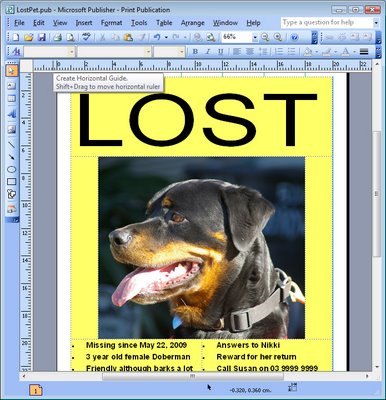
Before you make your sign, determine what you want to say and what information is most important for your audience to see. For example, for an Open sign, the word OPEN is critical and it will work without any other words very well. For a lost pet sign, the word Lost is important as it distinguishes the sign from others about pet grooming services, kennels etc.

Size of letters are important – a sign to be viewed from 3 yards/metres distance will need to have letters around 2.5cm/1 inch in height and you can add an extra 2.5cm/1 inch for every extra 3 metres/yards away your audience will be. The font size equivalent for letters 2.5cm/1 inch in height is around 72 points.

Colour is vital and it’s important that your sign be visible. The best colour combinations are high contrast ones such as black on yellow and white on black. Bad combinations are green on red or red on green – they’re indistinguishable to colour blind people and hard to read for the rest of us.

If you must use low contrast colours such as pale blue on white, add a black border around each letter to distinguish it from its surroundings.

When choosing fonts for your signs, stick to plain readable fonts and steer clear of script and other fancy typefaces. Fonts like Times New Roman and Arial and Verdana are good as they are clean and easy to read.

Capture interest
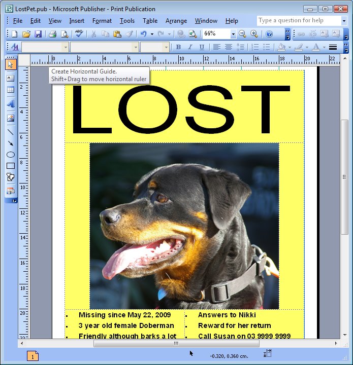
When you’re using photos to capture attention and to inform, make sure they are high quality and cropped to show the pet clearly. When typing information, group it logically so it’s easy to read. Include the details a person will need to have to contact you.

In the situation where immediate contact is crucial, creating tear off strips across the foot of the page is a good idea – a person can simply tear off the information they need and take it with them. However, make sure you also put the information on the sign as a person will need to have this available if the tear off strips are already removed.

Here’s how to create a sign with tear off strips.


Step 1
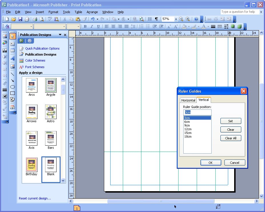
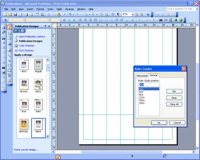
Start a new blank print publication. Choose File, Page Setup and set up full page printing and Letter or A4 paper size depending on the paper you will use. Choose Arrange, Layout Guides and adjust the margins to match your printers margins – the defaults are generally too big. Choose Arrange, Ruler Guides, Format Ruler Guides, vertical and add them at equal intervals across the page. Add one horizontal ruler across the bottom of the page.


Step 2
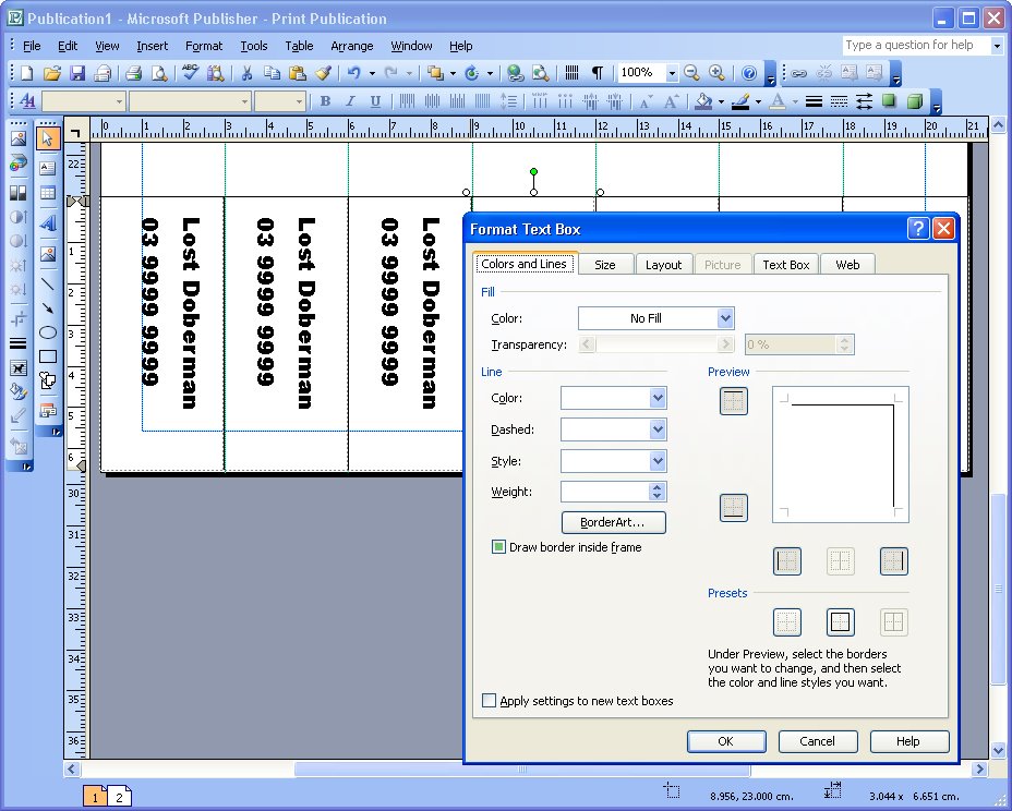
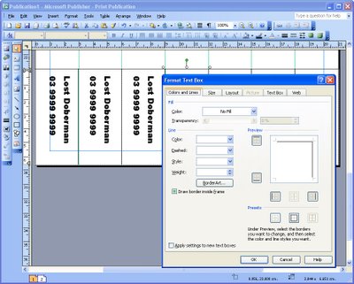
Create a text box and, in it, type the contact details for the tear off strip. Rotate the text by right clicking the shape, choose Format Text box, Text Box tab and check the ‘Rotate text within AutoShape by 90 degrees’ checkbox. Click the Colors and Lines tab and add a line to the top and right of the box. Drag the box into position and size it to fit. Hold Control as you drag a duplicate of the box to make the second box. Continue to complete all the boxes.


Step 3
Complete the rest of your sign by adding a large text message to attract a viewer’s eye. Add other explanatory text – make sure to include your phone number or contact details in the main notice in case all the tear off strips are removed. Focus on the important details someone will need to know. Add an image if desired to help attract attention.

Helen Bradley

Friday, May 22nd, 2009

Excel – print charts in black and white


Although your Excel chart might look great in color on the screen, if you’re printing to black and white or printing in color and planning to reproduce the charts in black and white you might be disappointed with the final result. Light green, light blue and light orange all look very different on the screen but are indistinguishable in black and white.

So, when your chart is destined for reproduction in black and white, set it up so it is guaranteed to be readible. To do this, select each series or data point by clicking on it, right click and choose Format Data Series (or Format Data Point)> Patterns tab > Fill Effects > Pattern and use a grey or a black and white pattern. Repeat for all the series and save before printing. The chart is guaranteed to look good when printed.

Helen Bradley

Friday, May 22nd, 2009

Keywords and Lightroom – the basics


As with any photo management tool Lightroom 2 offers you the ability to add keywords to your images. In this way you can make it easier to find images later on by searching for them by keyword. One simple way of adding keywords to your images is to do this as you import your images into Lightroom. Of course this requires that you’re importing a series of images which all share the same keywords. As this is not always the case, you may need to add keywords from inside Lightroom and I’ll show you how to do this.

Start in the Library module in Lightroom. While it appears possible to select multiple images in the Filmstrip whilst in Loupe view and add keywords to them this is not the case. The keywords will be added to only the first of the selected images and not all of them. Not only is this frustrating but it also is a little misleading.

Step 1
Instead, to add keywords to multiple images at the one time you need to select Grid view (G). Select the images to add the keyword to and type a keyword in the Keyword Tags panel on the left of the screen (open Keywording) to access this. You can also drag and drop a keyword from the Keyword Suggestions onto the selected images.


Step 2
You can add keywords to any image from the Keyword List by selecting the images, then right click the keyword in the Keyword List and choose Assign this keyword to Selected Photos.

Step 3
Once you have added keywords to your images you can find the images by keywords by accessing the Filter panel. Press \ to toggle the display of this panel which appears above the Grid panel of images. Select Text, in the first box, select Keywords in the second box select Contains All (or Contain) and type the keywords in the last box. Contains All is an AND search and requires that an image contain both keywords such as Florence and Church. Contain is used for an OR search which would return all images with either or both the keywords, Florence or Church. To cancel the search, click the X button in the search field.

While keywords aren’t the easiest thing to get a grip on, in Lightroom they are key to being able to index and find your images quickly.

I contribute to the Digital Photography School blog and this post first appeared on that site.

Helen Bradley

Wednesday, May 20th, 2009

Lightroom – Understanding Clarity, Vibrance and Saturation.


In Lightroom 2 the collection of Basic fixes available for your image includes three Presence sliders that sit together in the Develop module: Clarity, Vibrance and Saturation. This week I’ll explain the differences between these three adjustments and how they affect your photos. In each of the screenshots below I have set the slider value to 100 – way more than you would use to fix your image but a setting that will show clearly how the fixes work.


Step 1
Let’s tackle Saturation first. The Saturation slider works similarly to the Saturation slider in Photoshop or any other graphics software. It lets you adjust the saturation of the colors in the image – drag it to the right to brighten and deepen the colors in the photo. If you drag to the left, you remove some of the depth and brightness in the colors and, if you go all the way to -100 you end up with a desaturated or monochrome image.

One of the problems with using the Saturation slider is that it adjusts all the pixels in the image – those where the color is lacking in saturation and those that are already highly saturated. In trying to fix the pixels that need a color boost you can end up shooting some other pixels into right over the edge so the colors tend towards the ridiculous.


Step 2
The Vibrance slider solves some of the problems that you’ll encounter when trying to boost color saturation because it is more particular about what it adjusts. With vibrance only the least saturated colors in the image are adjusted and those pixels which are already relatively saturated are adjusted less. The result is that you’ll get a general improvement in the saturation in colors in the image but not to the extent where colors become unrealistically bright. Vibrance also offers some protection for skin tones which makes it a good choice for adding saturation to portraits as it is less likely to over saturate and destroy the subject’s skin tones. In many instances you can safely bypass the Saturation slider and adjust Vibrance instead.

Step 3
The Clarity slider affects the contrast in the midtones in the image. It works by increasing some of the edge detail in the midtones giving a general sharpening which adds punch to your photo. Typically you will want to adjust the Clarity of your image in a positive direction using a setting of around 10 to 15. If possible, view your image at 100 percent so that you can see the changes that you’re making to it as you adjust it.

Helen Bradley

Thursday, May 14th, 2009

Photoshop: Creating Cool Duotones


A duotone is an image made up of just two colors. It’s often used in the printing world where a photograph is included in a publication and where the publisher wants to use some color on the page but not pay for full color printing. As a duotone, the image is created as a mix of two colors – hence its name duotone. Typically the colors are black and a spot color but they can be any two colors.

You can convert a photo to a duotone in Photoshop using its Duotone feature and you can customize the duotone and determine just how much of each color is applied to the image.

Here’s how to convert your photo into a duotone in Photoshop.


Step 1
Open your photo in Photoshop and apply any desired adjustments to it – concentrate more on developing pleasing contrast in the image than on the colors because in the next step you will be removing the color.


Step 2
Create a black and white version of the image. Typically this is done by selecting Image > Mode > Grayscale. The problem with this conversion method is that you don’t get the chance to determine how the image is converted and it is often a lackluster result. You can do better by converting the image yourself.

I recommend using a specialist black and white conversion tool – in Photoshop CS2 you can use the Channel Mixer and in Photoshop CS3, choose the Black & White tool. To do this, choose Image > Adjustments > Black & White and drag the sliders to create your custom black and white image. Then choose Image > Mode > Grayscale and click Discard to discard the color.


Step 3
Choose Image > Mode > Duotone to display the Duotone Options dialog. From the Type list select Duotone. The first Ink color defaults to Black and you can now add a second ink color by clicking in the swatch box.

Because duotones are typically used in commercial printing, you are offered a choice of colors from a Pantone color swatch. If you aren’t printing commercially and if you prefer to use the color picker, click the Picker button and select a color this way – type a name for it in the text area.


Step 4
Click the curve icon to the left of each of the color in turn to adjust how the color is applied to the image. The highlights are on the right of the chart and the shadows on the left. Drag upwards on the curve to apply more color in that area of the image, or drag down to apply less color. This feature lets you add more of your second ink color, for example, to the highlights.


Step 5
You can save the Duotone settings by clicking the Save button and type a name for it. Later you can load those colors and the curve into the dialog to use for another image. When you are done, choose Image > Mode > RGB Color to convert back to color mode so you can continue to work on the image or to save it.


The Duotone on the right was created from an image converted to a monochrome image using Image > Mode > Grayscale. The one on the left uses a custom Black and White conversion first – notice the differences in how the duotone colors are applied.

Helen Bradley

Tuesday, May 12th, 2009

Lightroom: Spot fixing with the Adjustment Brush

One of the exciting new features in Lightroom 2 is the adjustment brush which lets you to make spot fixes to your image in Lightroom. These fixes apply to only the area you select rather than the entire image. This means you can make local adjustments for contrast, saturation, exposure, brightness, clarity and sharpness without having to take the image to Photoshop to do this.

In this post I’ll show you how to get started using the adjustment brush in Lightroom. 2


Step 1
Open Lightroom and click the Develop module. Locate the Adjustment Brush and click it to select it. Hold the brush over the image to check its size. The inner circle is the hard part of the brush and the outer circle shows the edge of the feathering. To adjust the brush size use the [ and ] keys or adjust the Size and Feather using the sliders.


Step 2
Select the adjustment to make, such as Brightness or Saturation by clicking its + symbol to increase its value or the – symbol to decrease it. Then start painting on the image to adjust that part of the image. When you start painting the effect onto the image, Lightroom places an identifying marker on the screen. Here I have Brightness selected and the marker is visible.


Step 3
If you don’t know where you have painted – and it’s often very hard to know exactly – press the O key to view or hide a mask which shows the area you have painted on. If you prefer to, you can display the mask as you work. The mask also appears if you hold your mouse over the marker.

To erase the brush strokes, click the Erase option in the brush area and erase over the area to remove the strokes. To return to painting click brush A which is the default brush and continue to paint over the area. You can also use the brush with the Alt (Option on the Mac) to remove the painted areas rather than switching between the brush and eraser.


Step 4
If the effect is too much or too little you can adjust the intensity of the effect using the slider.


Step 5
If another area of the image requires fixing, click the New option and then repeat the steps to select a fix and then paint it onto that part of the image. Later on you can adjust either of the fixes by first clicking the Adjustment Brush tool to select it and then click on the marker for the area to change – you will see that the word Edit is now highlighted – and you can now adjust the painted area or adjust the amount of the fix.

In a future post I will look at some more advanced functions of the Adjustment Brush.

Helen Bradley

Wednesday, May 6th, 2009

What cell is that? Identifying table cells in Word

When you’re working with Word and doing math in your tables, you need to know the name of each table cell. In a largish table it can be difficult to keep track of everything.

Back in the days of Word 97 a macro shipped with Word that would tell you the name or cell reference of a given table cell. Here’s how to take a step back in time and get that macro, install and use it, with later versions of Word:


Visit http://support.microsoft.com/kb/q172492/  http://download.microsoft.com/download/word97win/addin/1.0/W9XNT4/EN-US/Wdtlupd.exe and download the file Wdtlupd.exe which is referred to on this page. This is a self-extracting zip file which includes various documents, the one we’re using is not version specific. Run this file and select a location to save the extracted files into.


Open the folder containing the extracted files and double click the file macros8.dot to open it in your version of Word. If prompted to do so, click the Enable Macros button and the file will open automatically in Word. Now choose Tools, Macros, Visual Basic Editor if you are using Word 2003 or earlier. In Word 2007, make sure the Developer tab is visible (Office button > Word Options > Popular > Show Developer tab in the Ribbon). Choose Developer tab > Visual Basic.


Locate the Macros8.dot file in the Project list on the left of the screen and click to open its Modules collection. Locate the module called TableCellHelper and double click it open the code window. Select the code and copy it by choosing Edit, Copy.


Locate the file Normal in the Project collection and click its Modules collection. Choose Insert, Module to add a new module, double click to open this new module and choose Edit, Paste to paste the copied code into the module. In the Properties area (choose View, Properties Window to display this if needed), alter the module name to TableCellHelper and, when you’re done, close the Visual Basic editor and close the file created using Macros8.dot.


In Word 2003 and earlier, run the macro by clicking somewhere inside a table and choose Tools > Macro > Macros from the Macros in list choose Normal.dot and locate and run the macro called TableCellHelper. In Word 2007 click the Developer tab > Macros and from the Macros in list choose Normal.dotm and locate and run the macro called TableCellHelper. The macro will report the cell address and the total number of rows and columns in the table.


If you’d use this macro repeatedly, add it as a button to your Word 2003 (and earlier), toolbar by right clicking a toolbar and choose Customize. Click the Commands tab, select Macros from the Categories list and locate and drag the macro TableCellHelper on to the toolbar. Right click the new button and edit the name so it is shorter and more helpful. Close the Customize dialog.

  • Updated 4 Oct 2017 to list a new download site for the file.

Tuesday, May 5th, 2009

Photoshop: Partially removing color

While there are lots of ways that you can convert an image into black and white in Photoshop sometimes you want to remove some of the color but not all of it.

One method to do this, is to use a tool such as an adjustment layer to remove the saturation from the image or to apply a black to white gradient map adjustment. This removes all the color and you can then recover some of it by reducing the opacity of the adjustment layer to show some of color from the image layer underneath. However, when you adjust opacity, the setting is applied to every pixel in the image so light and dark pixels are treated equally.

You can achieve a richer effect by using the image as its own mask so that the desaturation effect is applied with different strengths to pixels in the image depending on their relative lightness or darkness.

To see how this effect can be achieved:


Step 1
Open a new image and add an adjustment layer to convert it to black and white. I used Layer > New Adjustment Layer > Gradient Map and used the Black, White gradient from the basic set of gradients.


Step 2
Click the Adjustment Layer’s layer mask to select it – this is the white box in the Layer palette to the right of the Adjustment layer thumbnail. Choose Image > Apply Image. This tool lets you apply the image to itself as a layer mask. The current image name should appear in the Source Image area and you need to apply it to the Merged layer. Experiment with selecting and deselecting the Invert checkbox, if you have Preview selected you’ll see how each setting affects the image. Choosing Invert typically gives the best looking results and it’s the option I chose. Click Ok to add the image as its own layer mask.


Step 3
Inspect the image and let’s talk about what’s happening. The screenshot here shows the mask (not the resulting image). You can toggle the mask’s visibility on and off by Alt + Click (Option + Click on the Mac) on the Layer Mask thumbnail in the Layers palette.

Masks are grayscale so they’re always black, white or shades of gray. They work like this: where they are white, the current layer is shown – that’s the black and white conversion in this example. Where the mask is black, we are seeing through the current layer to the colored layer below. Where the mask is grey we’re seeing some partial transparency in the black and white layer so some color is showing.

Here the mask is dark in the sky area and around two of the buildings on the left so you’re seeing some blue in the sky and color in the buildings in this area. Where the mask is white, the image is almost all desaturated.


So you can see how subtly different the results are using this method, here’s the original image, the version we just created using the Apply Image command and another version showing the result with the same Gradient Map adjustment layer but this time with a reduced opacity and no layer mask. The significant differences are in the sky which is bluer and the grass which is more desaturated in our example – a result you cannot achieve by simply adjusting the opacity.

Tip
Masks can be adjusted just like regular layers. So, you can create more variety in the mask by clicking on it, and choose Image > Adjustments > Levels. Adjust the levels to suit – if you lighten the mask you’ll make it whiter overall which means the image will become more black and white and less colorful. If you darken the mask then you will see more of the colored image below.

I contribute to the post production blog at Digital Photography School and this post first appeared there.

Helen Bradley

Page 1 of 212