Articles | Photography Blog | Office Tips Blog | about me | e-mail

Helen Bradley - Photoshop and Lightroom tips and techniques

I'm Helen Bradley - I'm a photographer and Photoshop professional. In this Photoshop and Lightroom blog you will find powerful Photoshop and Lightroom tips, tricks and techniques that will help you get more out of both programs. You will also find step by step guides for working creatively with your photos in Lightroom and Photoshop and any other cool applications I know you will be interested in knowing more about.

Tuesday, November 03, 2009

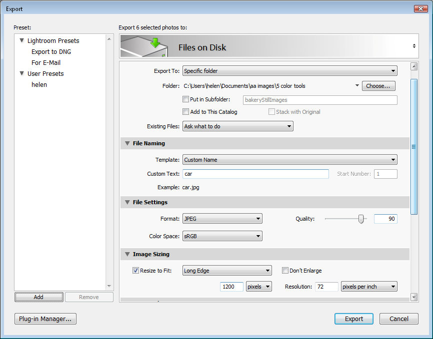
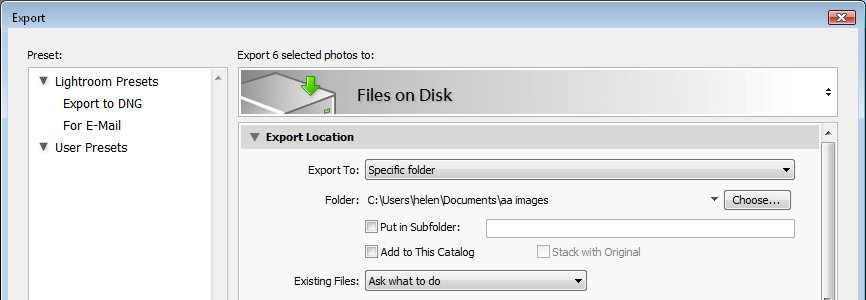
Simple Lightroom image fixing workflow


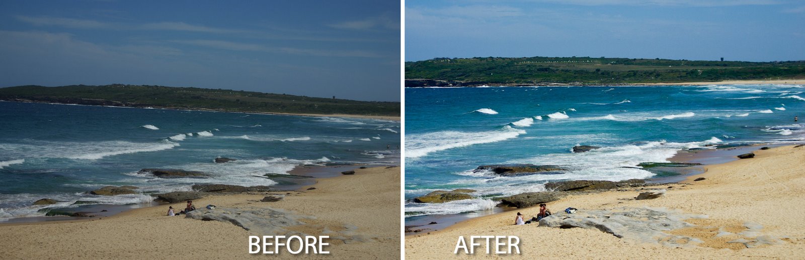
Whether it’s a photograph of mom that you’re sending to her or an image that you’re preparing to print, most photos can use some fixing before they’re ready to be shared or used.

Here’s a quick and easy Lightroom workflow that I apply to most every day images before sending them to family and friends, posting them to Flickr or my blog or printing them for a paper based photography project.

If you’re new to photo editing or to Lightroom, this step by step process should get you on the way to fixing your images.
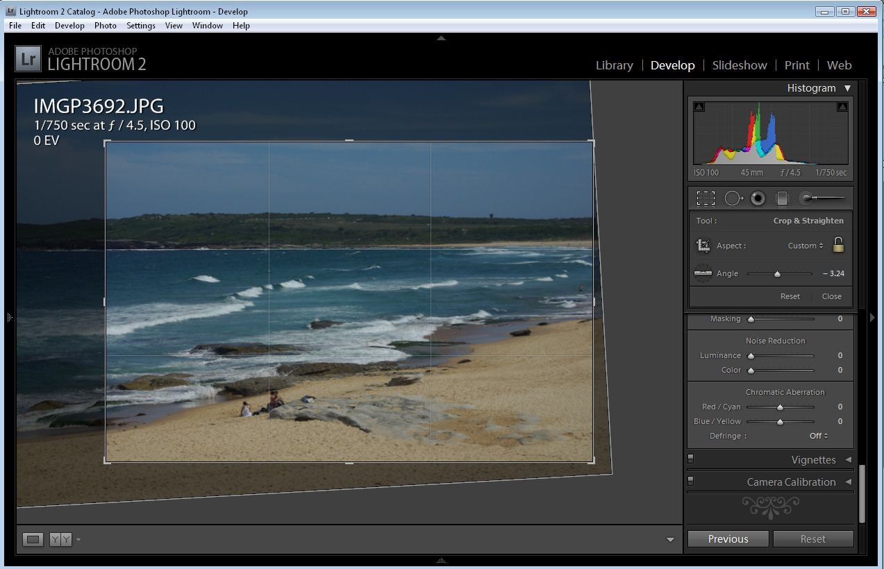

Step 1
The first step to fixing an image is typically to straighten and crop it so that you remove any areas that you don’t want to include in the final image.

To help you apply the rule of thirds to your crop, in Lightroom the crop grid, by default, shows a 'rule of thirds' grid over your photo.

Place an object of interest in the photograph over the intersection between the gridlines or place the horizon or another strong horizontal line along one of the horizontal lines to achieve a pleasing composition.

Here I’ve cropped and sized the image to place the waterline along the top line of the grid.
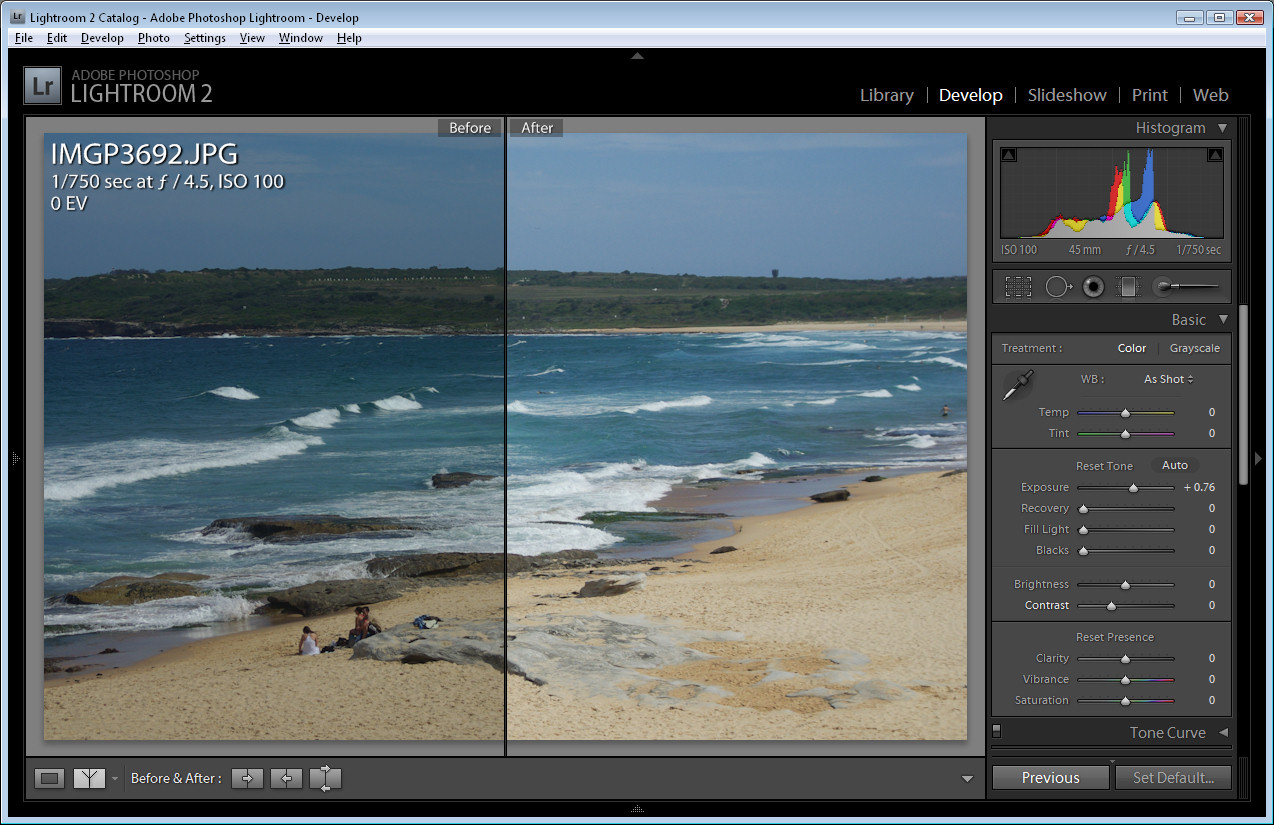

Step 2
Adjust the Exposure by dragging on the Exposure slider. This image is a little underexposed and the histogram falls well short of reaching the far right of the chart area. Increasing the Exposure fixes this.
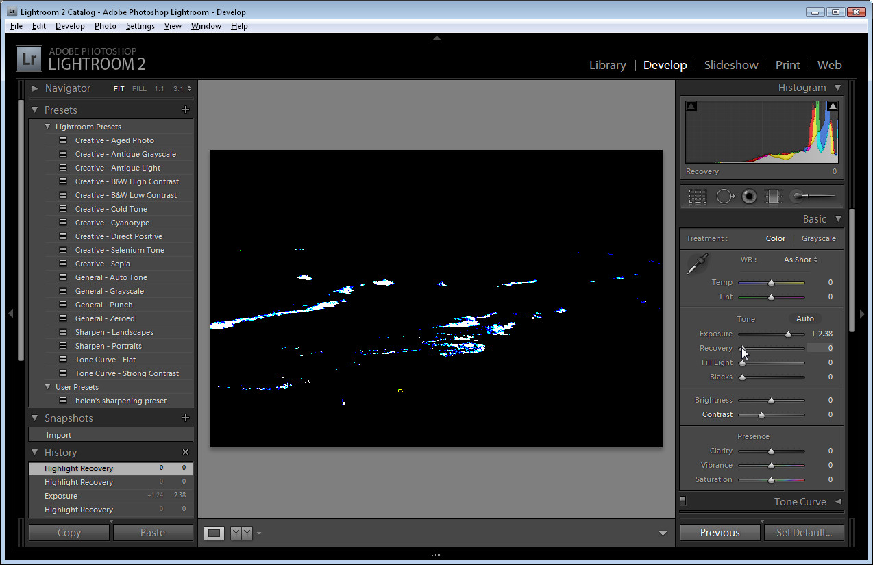

Step 3
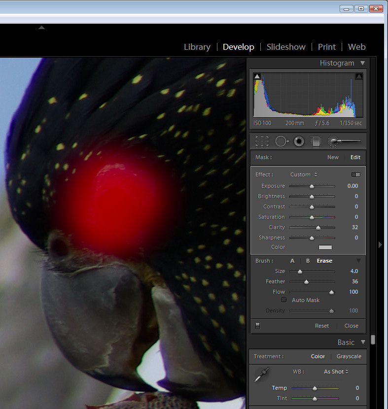
To test to see if you need to use the Recovery slider to recover blown highlights, hold the Alt key (Option on the Mac) as you click on the Recovery slider handle. If you see light areas on the image, drag to the right to recover them.

Here I artificially increased the Exposure before doing this to show you what the image will look like if you need to use the Recovery slider. If you see something like this on your image and if it is nicely exposed, drag the Recovery slider to the right to remove/reduce these areas.
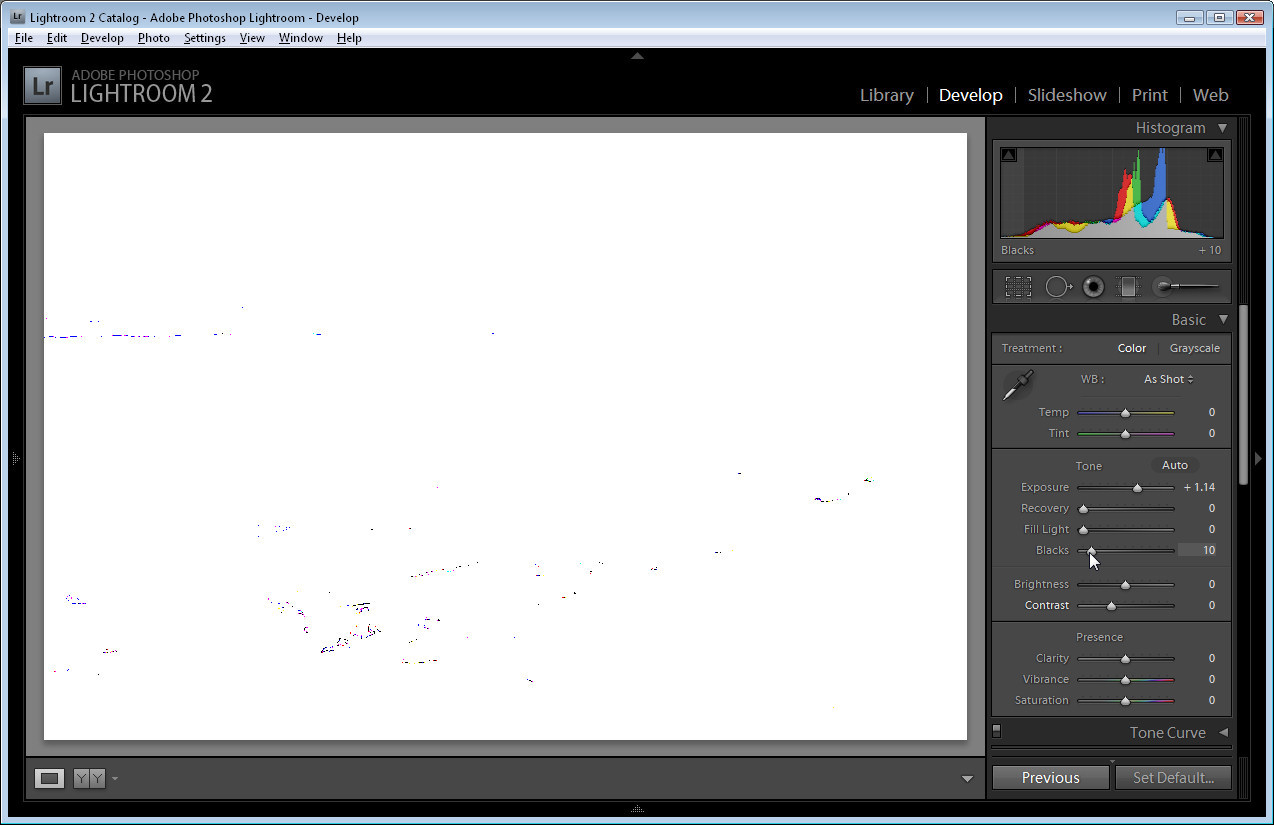

Step 4
Hold the Alt key (Option on the Mac) and drag the Black slider to the right until you see the smallest hint of black appearing in the image. You use this slider to ensure that your image has some blacks in it.

By now the histogram should extend to the very left and right of the chart area ensuring that your image has a good tonal range.
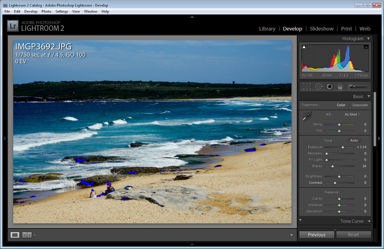

Step 5
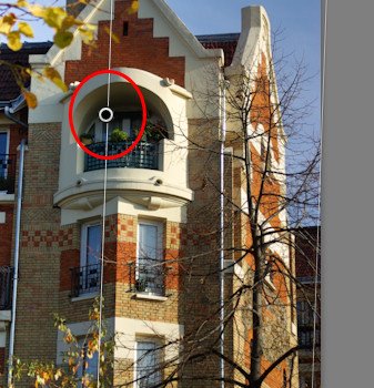
If you have some areas that are clipped you will see white arrows in the histogram area. You can hold your mouse over these to see the clipped areas on the image. If areas are clipped you will have blown out highlights or plugged shadows which are generally undesirable.

Here I have over adjusted the Black Clipping slider so there are some plugged shadows that you can see colored blue on the image.
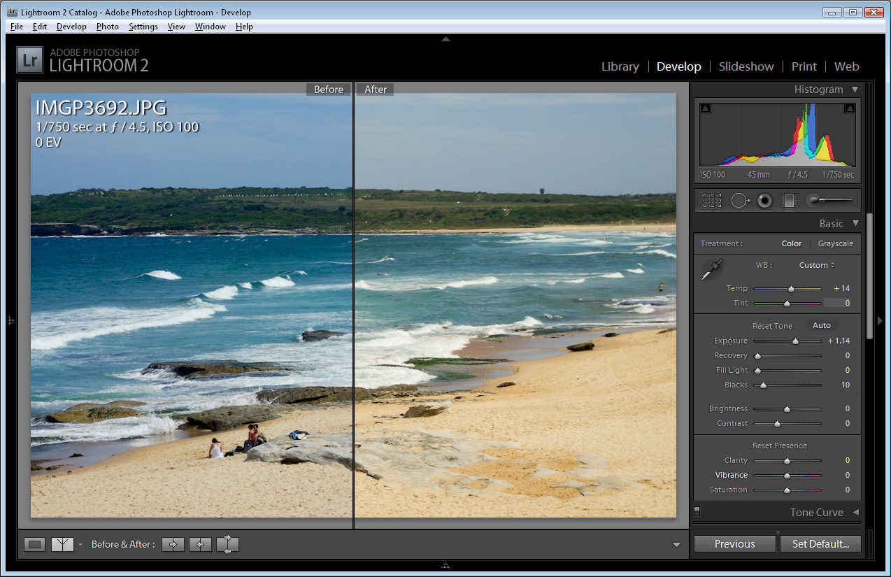

Step 6
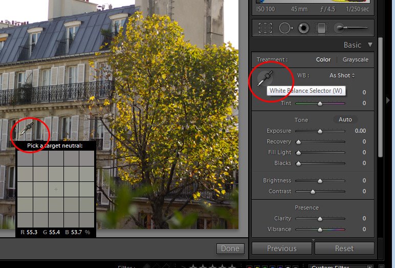
You can use the White Balance tools to adjust the white balance in the image. Drag the Temp slider to the right to add warmth to the image or to the left to make it colder. Dragging to the right warms the image by adding peach/orange tones to it and dragging to the left cools the image by adding blue tones.

If you're shooting in RAW or DNG then there will be a range of options available from the White Balance dropdown list.

Here I've added a lot of warmth to the image to show what is possible.
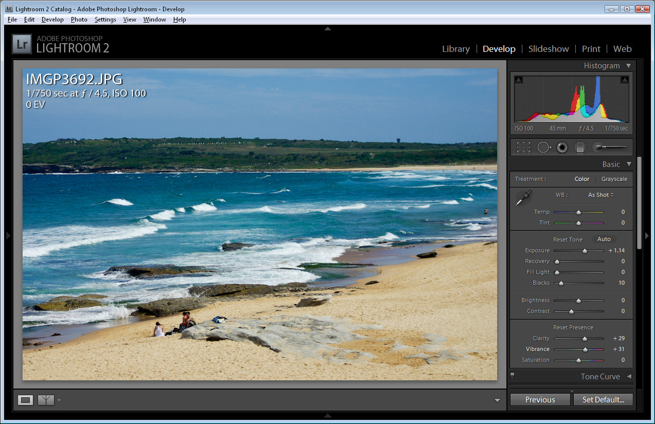

Step 7
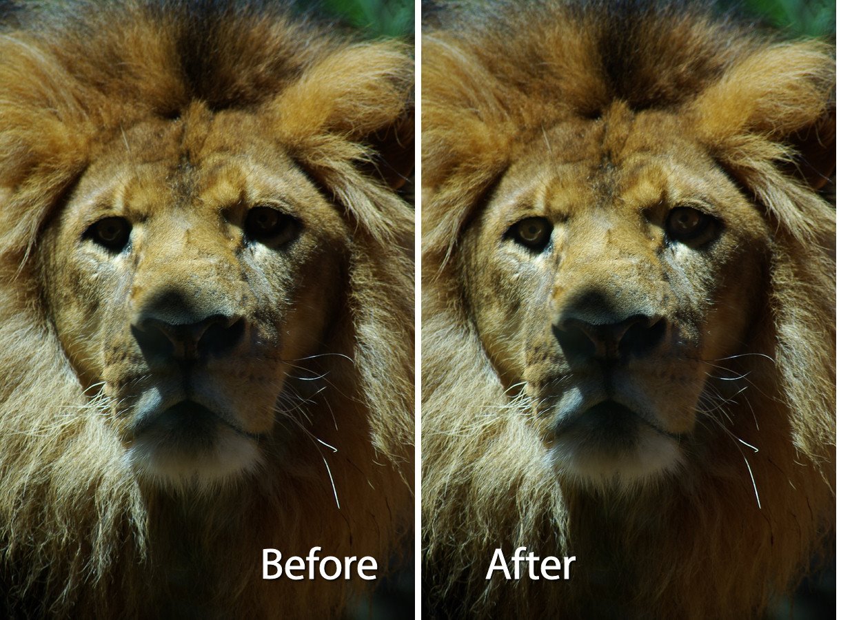
You can also adjust Brightness and Contrast although I prefer to skip these adjustments and add some Clarity to adjust and sharpen the midtones and some Vibrance to boost the color in the undersatuated areas in the image.

From here I would sharpen the image and it's ready to go.

In a future post I'll explain the basics of sharpening in Lightroom.

Labels: ,

Saturday, October 24, 2009

Lightroom: Print with colored backgrounds


One issue with Lightroom is that all the images that you print from the print module print with white backgrounds.

While Lightroom does not offer color backgrounds for images, there is a workaround that you can use to print with any color background you like.

Here’s how to do this:


Start in Photoshop or another bitmap editor that lets you create and save JPG images. Create a new image the size of the page that you want to print.

For convenience, I'd create images for all the paper sizes you plan to use all at once. This means you may want one for 5 x 7" paper, one for 4 x 6" and one for Letter paper for example. Whatever size you print at, create a new image that size and at around 96 pixels per inch if you’re using a solid color background.


Fill the document that you have created with the color background that you want to use. For example, if you want a black background, fill the documents with black and for another color background, fill the document with that color.


If you typically use an Identity Plate to print your name or other details on the image in Lightroom then you'll need to know that what you’re doing right now is creating something that will replace the Identity Plate in Lightroom so you can't use both a background and a text identity plate.

However, if you know this ahead of time you can add the same details you add to your identity plate to this image as text.

If you plan to do this, you’ll will need separate documents for each paper size in each of the two orientations: Landscape and Portrait. If you’re just using plain backgrounds you won't need to create one in each orientation as you can rotate the images later on - you just won't want to rotate something that has text in it. You will probably want the images to be a better size for printing so 1500 x 1000 pixels will print on 6 x 4 paper at 250 dpi so the text will look crisp and neat.

Once you’ve created all your documents, save each with a name that indicates its size and color and, if relevant, its orientation. I suggest you save it somewhere that will make it easy to find and so they are safe from being removed accidentally.


Return to Lightroom and switch to the Print module. Set up your image or images to print. You can use a Contact Sheet/Grid layout or a Picture Package.

To add your background locate the Overlays panel on the right and click the Identity Plate checkbox. Click on the Identity Plate to display the menu and select Edit. When the Identity Plate Editor dialog opens, click the Use a graphical identity plate option and click Locate File.

Select the image that you created for this paper size (and orientation, if applicable), and click Choose. Click Ok to add the image as the Identity Plate.


When the image appears in the document set the scale to 100 so it fills the page layout and drag it into position.

You might notice that you cannot make the image any bigger than the page itself and you can't drag it out of its original aspect ratio - this is why you need to create multiple versions of the image one for each paper size as the ratios 8:10, 5:7 and 4:6 are all different.


Once you’ve dragged the background over the entire page, click the Render Behind Image option in the Overlays area.

This moves the solid color image behind the pictures on the page.

You can now change the stroke border if desired to, for example, add a white or gray stroke if you’re using a black or dark gray background.

Then go ahead and print your image.


You might realize by now that any image can be used as a print background.

So, for example, you can crop an image in Lightroom to the size that you need for the background, export it to disk as a JPG and then reimport it as an Identity Plate to use as a background for your printed images.

You could do this with a black and white version of an image or a color version. The Overlays > Identity Plate area also provides an Opacity slider allowing you to make the image partially opaque to lighten it so it doesn’t overwhelm the images you are printing.


When you are done, save your Identity Plate by clicking on the Identity Plate option, choose Edit and then from the custom dropdown list, choose Save As and save it so that it can be easily accessed next time.

Labels: , ,

Friday, October 16, 2009

Lightroom - 10 objects you didn't know could be dragged, clicked or opened

If you’re new to Lightroom, there are a lot of interface options that you may not realize hide must know and handy program features. In this post, I’ll show you some of the buttons, icons, samplers and switches that a knowledge of Photoshop (at least versions prior to CS4) won't help you identify or locate.


1 Navigator
In the top left corner of the Library and Develop modules you'll see the Navigator. Beside it are the Fit, Fill, 1:1 and 3:1 options. Click these to resize the image in the current window to various sizes including fitting in the space, filling it and 1:1 and 3:1 resizing options. Other sizing ratios are available from the dropdown list.

The 1:1 ratio is particularly useful when you’re sharpening an image. You may already know that, when you hold the Alt key as you drag on the sharpening sliders the small preview image turns to a grayscale mask showing you the impact of the slider on the image.

If you are in 1:1 preview, the entire image acts as the preview, allowing you to focus in on a much larger area of the image and see the sharpening effect. 3:1 and other larger sizes also work but 1:1 is the minimum size


2 Switches
Switches in Lightroom appear in areas such as the Develop module where they can be used to enable or disable a setting such as the Tone Curve. Switch the switch to the up position to turn it on and to the down position to turn it off.

When using the Adjustments Brush the switch works from left to right to select to work with one fix at a time (Effect Buttons) or to work with multiple adjustments at once (Effect Sliders).


3 Arrows
In the Library > Keyword list panel, you can click the arrow to the right of a keyword to view images that have that keyword associated with them.

These arrows only appear when you are hovering over a keyword in the list.


4 Expand/Collapse Triangles
Throughout the Develop panel, for example, are small triangles beside the various options that you can click on to display or hide that option. For example, when Detail is not visible click its triangle and the detail panel will display.

There is another triangle directly below the Detail triangle which appears only when it is expanded. Click this to display and hide the sharpening preview dialog.

Watch out for these triangles - sometimes they aren't light gray and are, instead, almost black and difficult to see.


5 Area Picker
Also in the Detail area of the Develop module is a small square icon with lines radiating from it that you can click on and then click on an area of the image to determine what shows in the preview panel for the sharpening process. This icon has a visible tooltip which helps identify what it does - most do not.


6 Eyedropper
In the Develop panel’s Basic module is a white balance selector icon. Click it and click on an area of the image which should be white.

This adjusts the white balance of the image based on that selection. It also displays a small 25 x 25 pixel grid showing the pixels in the general area so that you can be more accurate in your selection.


7 Adjustment Markers
When you use the Adjustment Brush or the Graduated Filter, you will see a marker on the image which, when you click on it turns into a black circle surrounded by a lighter circle.

This marks the adjustment or the filter and you need to click this to select it before you can make alterations to the adjustment or to the filter.


8 Invisible clickable rotation options
In the Print module, watch out for items that don’t even look like they are selectable.

For example, in the Overlays > Identity Plate area when you have the identity plate enabled there is a small indicator to the right of it showing the current rotation in degrees.

If you click it you will see a popup menu offering other rotation options.


9 Way big buttons
Watch out for panels at the top of dialogs which can contain selectable options. For example, a dialog that has a large area like that shown in this image is often selectable offering different options but because it doesn’t look like a typical selectable option, it’s easy to overlook.


10 Direct Adjustment tool
In some areas such as the Tone Curve and Hue/Saturation Lightness in the Develop module you’ll see a small adjustment indicator in the top left of the panel area.

Click it and then drag on the image to change the image at that point.

While in Photoshop CS3 you would drag left to right to alter the sliders, in Lightroom you’ll typically drag up and down with this tool.

While these aren’t all the unusual buttons that you’ll find in Lightroom, it should help you understand that a lot of the features in Lightroom are hidden behind icons and buttons for which even a program like Photoshop is no adequate preparation for locating, understanding and using.

Labels: , ,

Tuesday, October 13, 2009

Highlight Color effect in Lightroom


One effect many people like to use with their photos is to remove all the color from the image and leave it in only one place in the image. For example, in a wedding shot you might turn the entire image into black and white leaving just the bride's bouquet in color.

Here's how to achieve this effect in Lightroom using the Adjustment Brush.


Start with the image selected in Lightroom and switch to the Develop module.

Click on the Adjustment Brush and make sure you have it set to Show Effect Sliders so that you can adjust multiple sliders at once. Drag the Saturation to -100.


Click the letter O so that you can see as you paint and with a large size hard paintbrush click on the image in an area you want converted to black and white and then paint over the image in all places that it should be turned to black and white.

It will be quicker if you set the feather to a low value, the brush to a large size and disable the Auto Mask option for now.


To work close around the edges of the area that you want to leave in color, set the brush size smaller and work slowly around the edges.

If you go too far, press the Alt key (Option on the Mac) and paint out the overlay color. The Eraser uses a different brush so make sure it too is set to have Auto Mask disabled and a low Feather value.

To zoom in click Z and to move the image, press the Spacebar as you drag on it.


Once you have the area selected that you want to convert to black and white, disable the overlay color by pressing the O key.

This leaves the selected area in black and white and the unselected area in color.

You can now tidy up the edges if necessary by using the Adjustment Brush tool - just make sure that you click on the marker for the Adjustment before you start painting - it should show a black center - if not, you're making a new adjustment and not editing the existing one.


You can adjust the other sliders, if desired, to improve the black and white portion of the image. For example you can boost the Contrast and Clarity if desired. When you're done, click the Close option at the foot of the panel to finish.

In this example I added another adjustment using the Adjustment Brush over the top of this one to reduce the exposure and brightness in the sky to add back some of the cloud detail lost in the conversion of the image to black and white.

Labels: , ,

Friday, October 09, 2009

How to select and compose a Triptych in Lightroom


In a recent article, I explained how to create a triptych in Lightroom. The solution covered the mechanics of setting up a triptych template in Lightroom.

In this post, I’m going to address the issue of selecting images to use in the triptych. I'll explain some rules of composition and show how I make a selection of suitable triptych photos.

There are some basic rules of design that will help you layout a triptych and I like best the four rules Robin Williams explained in her wonderful book: The Non-Designer's Design Book. In it she describes the rules of Alignment, Proximity, Repetition and Contrast and these form the basics of any good design and can be applied to our triptych.

In our template design we already have alignment covered - the photos are positioned so the top and bottom of each image is on the same horizontal line and the spacing between all the images is equal.


We’ve also got proximity covered - the photos are positioned close together rather than scattered in different places on the printed page. The template itself is providing us with some strong design elements and that is, in part, why a triptych looks so good.

As a rule, our eyes like odd numbers of elements so a single image or a triptych often look better than a diptych - two simply is not so pleasing a number of elements to look at.

When selecting images for a triptych, you want three images that relate to each other in some way such as location, people, genre and so on.


I like to start by selecting a five or six images which I think will work well together and then try them out. I assemble a collection of these images (make a collection, not a smart collection) so that I can work with them in the print module and not have other images in my way.

Select three of the images to use to start with. The order that the images appear in the photo strip is the order that they appear in the triptych. If the order isn’t right, drag the images into a different position in the photo strip and the images will be rearranged in the triptych too.

One way to create a safe design is to ensure that the horizons in the images (or each subject's eyes) are roughly level across the triptych and, when combining different images, look for images all shot at about the same zoom. This doesn’t mean you can't mix image sizes, it just means that its sometimes easier to get them to look good if they are the same size.


If you have elements that have a strong sense of direction such as the carousel animals in this triptych, place the animals so they face inwards rather than outwards from the design.

If they point outwards the viewer’s eye will follow them straight off the page. If you direct them into the triptych your viewer's eye will stay there longer.


While this sequence of birds look alright the directions in which they are facing and the fact that the three images are so similar is actually a little distracting.


In this version, I moved the images around and replaced one with an image of two birds which adds some variety to the mix. The result looks better to my eye.


This triptych combining two streetscape images and a door, while all from a similar location, look unbalanced to me. The door doesn't co-ordinate well with the street images and it is facing out of the image. In addition the door is a little too colorful for the other two images and it doesn't enhance them. I like the arrangement better when a different image is used and one which is more in keeping with the others like this image:


Developing an eye for what looks balanced and what doesn't will take time. I highly recommend Robyn Williams' book as a starting point for understanding basic design and this video may help to understand some of the principles at play: http://www.microsoft.com/video/en/us/details/e1882b7a-5e66-45cd-b5b4-28301c0a747e

If you found this useful, here is the original post on how to create a triptych in Lightroom.

Labels: ,

Thursday, October 08, 2009

Fixing Animal Eyes in Lightroom 2


Often when I look at the photographs that I’ve taken at the zoo, for example, the animals’ eyes are underexposed and lifeless.

To fix animals’ eyes in Lightroom so that they look compelling and still realistic, here is my fixing "animals eyes" workflow:


Step 1
Display the image in the develop module in Lightroom. Zoom in using the zoom tools so that you can see the area that you’re working in very clearly.

Click the Adjustment Brush in the top of the Develop module panel and size the brush so that it is the right size to work on the animal’s eye. Click once on the eye and then paint over the area that you want to affect. If you can’t see your paint and want to see it, press the O button to enabled and disable the ruby overlay.


Step 2
Once you’ve painted over the eye, adjust the Exposure and Brightness upwards until you have a highly unrealistic and over fixed solution.

Adjust the Contrast so that you build some contrast back into that area of the eye - this actually darkens some of the areas you have just lightened.

Adjust the Saturation and Sharpness if required.


Step 3
If the effect is too strong around the edges of the eye, click Erase, set the Feather to a high value and paint around the edges of the selection to erase the effect.


Step 4
In this image, I tacked both eyes separately and I did both in two steps. The first fix solved the overall eye problem including the surrounds and then I repeated the process this time focusing only on the pupils to ensure that there was good contrast where the pupil would be expected to have caught the light.


Here you can see the result when steps 1-3 were performed in Lightroom on the lion's eyes.

Labels: ,

Friday, October 02, 2009

Resizing images in Lightroom 2


One of the hardest things for a new Lightroom user to work out how to perform is a simple image resizing. Look as hard as you like and there simply isn't a resize menu command. There is, of course, a way to resize images and it is done as you Export them from Lightroom which makes sense when you know how Lightroom works but if you're a new user it's just plain confusing.

So, here's how to batch resize in Lightroom:


Step 1
Select the Library module and select the images to export. Choose File > Export.


Step 2
The Export dialog gives you a series of choices for the exported images. Start by selecting where the exported images should be stored. Choose either a specific folder or the same folder that the originals are stored in.

To place the images in a subfolder of your chosen folder, select Put in Subfolder and type the name of a new subfolder to create. If you want the exported images to be available in Lightroom, select the Add to This Catalog checkbox. From the Existing Files dropdown list, choose what to do if files of the same name appear already in the selected folder.


Step 3
From the File Naming options select what you want your files to be named.

For example, selecting Filename will give the files the same name as the original images. Custom name - Sequence lets you give the files a custom name and Lightroom will add a sequential number to each file. Type the Custom Name in the Custom Text box.

You can also select Edit from the dropdown list and create your own file naming template.


Step 4
In the File Settings area, select the export format such as JPEG for the web and the Quality - the higher the quality, the larger the file size.

In the Color Space area choose sRGB for the web.


Step 5
In the Image Sizing area set the file size and resolution. So you can, for example set the Resolution to 72 pixels per inch for the Web or 300 ppi for printing.

To size the images, enable the Resize to Fit checkbox. By selecting Dimensions you can set the final dimensions for each image such as 800 x 1200 and the images will be sized as close to this as they can be given their current aspect ratio. They won't be larger than this and one measurement at least will be 800 or 1200. Lightroom does this regardless of whether the images are in Portrait or Landscape orientation so portrait and landscape images will end up the same sizes.

If you select Width & Height you can set the longest dimensions of each image in each direction. All images will be sized so their Width is no larger than the value you set and their Height is no larger than the value you set - the same width and height values are applied to portrait and landscape images so a Width of 400 and Height of 600 will give a larger portrait image than it will a landscape one because the landscape image can’t be wider than 400, forcing its height to much less than this.

The Long Edge and Short Edge options let you set the maximum length of the long or short edge of a photo - so Portrait and Landscape images are treated alike here.

If you enable the Don’t Enlarge checkbox you could have images much smaller than your selected dimensions if the originals are already under the selected size.


Step 6
You can apply sharpening by selecting the Sharpen For checkbox from the Output Sharpening options and select to sharpen for Screen, for example, and set a Low, Standard or High Value of sharpening.

In the Metadata area, select to add metadata if desired and from the Post-Processing options select what to do with the images afterwards, for example you could open the images direct in Photoshop or in an alternate editor or another application or show them in Windows Explorer.

When you’re done with the selections, click Export and the selected images will be exported.


Step 7
If you'll use these settings again, save them to use next time by clicking the Add button at the foot of the Preset list, type a name for the preset, select the folder to add the preset to or just leave it set to User Presets and click Create.

In future, you can return to the Export dialog and select these options by clicking the Preset name. You can still make changes to the settings, if desired, and export a new set of images.

Labels: , , ,