Articles | Photography Blog | Office Tips Blog | about me | e-mail

Helen Bradley - Photoshop and Lightroom tips and techniques

I'm Helen Bradley - I'm a photographer and Photoshop professional. In this Photoshop and Lightroom blog you will find powerful Photoshop and Lightroom tips, tricks and techniques that will help you get more out of both programs. You will also find step by step guides for working creatively with your photos in Lightroom and Photoshop and any other cool applications I know you will be interested in knowing more about.

Wednesday, June 17, 2009

Photoshop - keep a log of everything you've done

How many times have you created a neat effect on an image using Photoshop and then wanted to duplicate the effect on another image? The problem is that unless you’ve taken notes about what you've done, it is often difficult if not impossible to remember exactly the steps you took to get the final image.

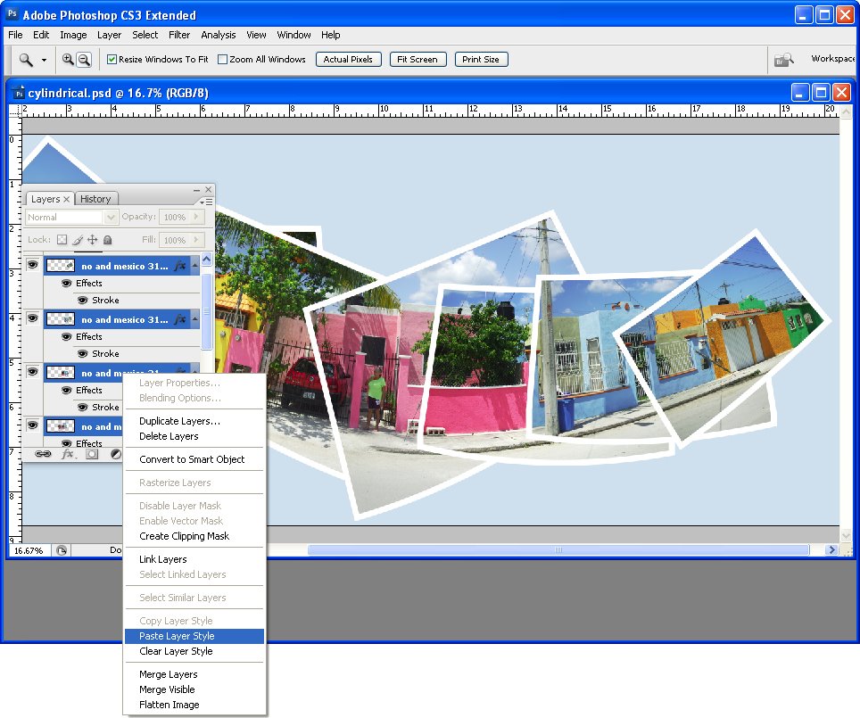
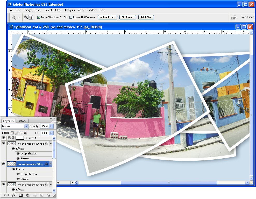
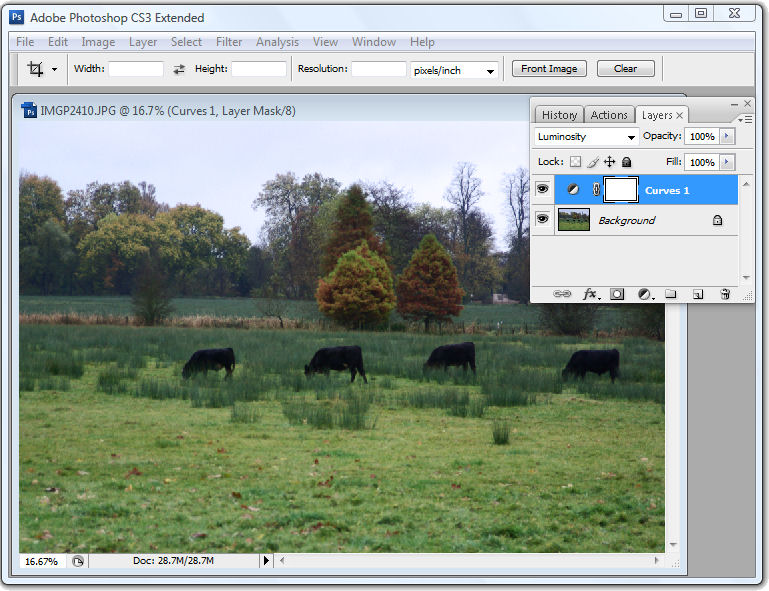
While Photoshop has a History feature this is of limited use. One problem is that, by default, Photoshop only stores 20 history states so, if you've performed a lot of steps they may not all appear in the list. The second problem is that, even if you have configured Photoshop to store a large number of history states, all you see in the History panel is a brief description of what you did to the image such as Gaussian Blur, Apply Image, Blending Change and you don't see the actual settings used.


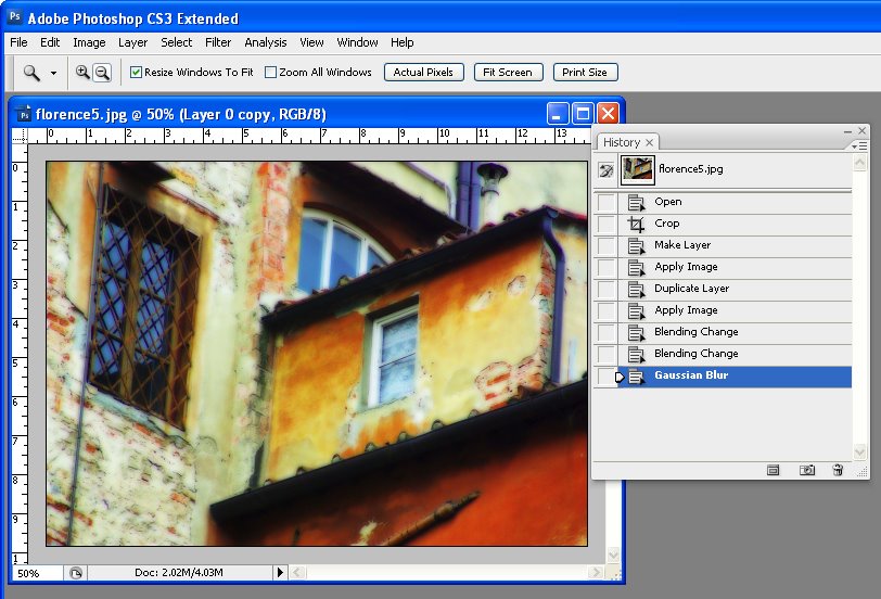
The History panel in Photoshop lists the basics of what you've done but not the detail.

Here are some ways to improve on the basics and keep a log of your work:
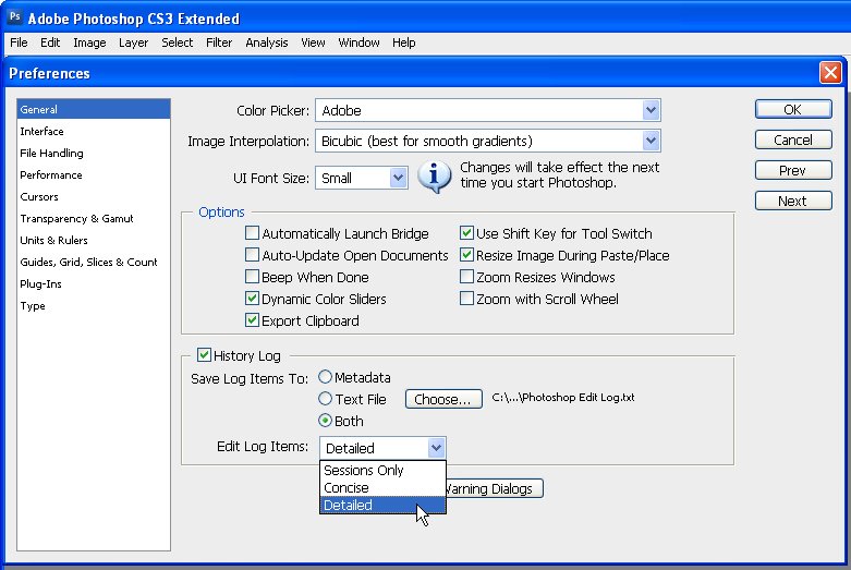

Step 1
Before you start work on an image choose Edit > Preferences > General and select the History Log checkbox. You can select to save log items to the image Metadata, to a separate text file or to both. If you select either Text file or Both you’ll be prompted to enter a file name and a location to save the file to. Do this and click Save.

From the Edit Log Items dropdown list select Detailed. Sessions records only the time you spend working on a file, Concise records the Sessions information and the detail from the History palette and Detailed records the detail about the changes – it's Detail you need.
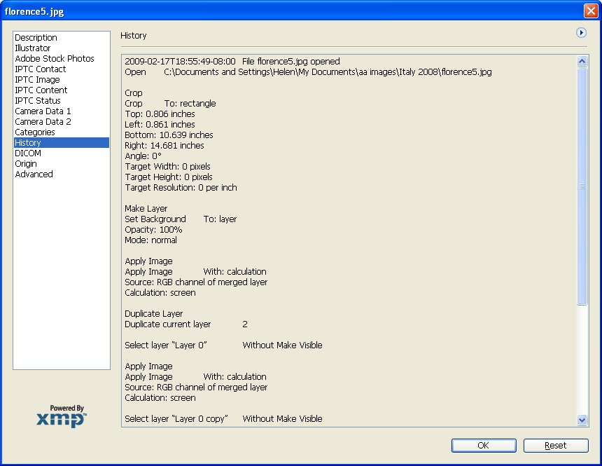

Step 2
Now, when you work on an image, the detail is stored in the text file, the Metadata or both, depending on the setting you chose.

If you chose to store the data in a text file you can later open the text file with a word processor or a text editor such as Notepad on the PC.

If you chose to record the history in the image metadata choose File > File Info > History and you can read details of the edits you made to the image in the dialog. Use this information to perform the same steps on another image
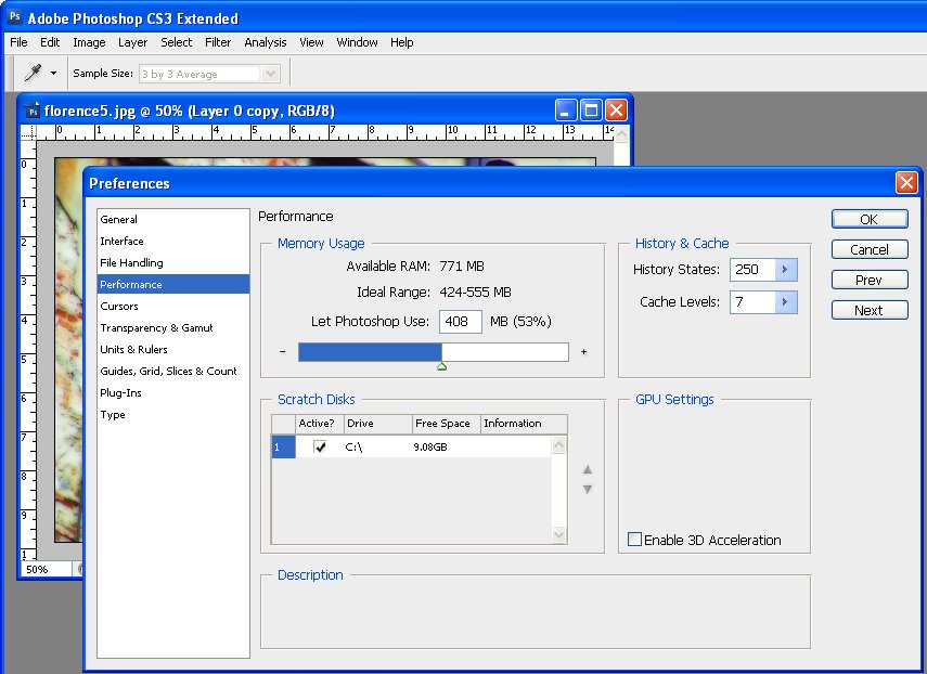

Tip
To configure Photoshop to store more than the default 20 history states, choose Edit > Preferences > Performance and set the History States value to a higher number. You should note that this History information is available in the History palette and only while the image is still open – it is lost when the image is closed – unlike the Log data which is stored permanently.

Labels: , , , ,

Wednesday, April 15, 2009

How to merge or combine paths in Photoshop


One of the most difficult things to work out how to do in Photoshop if you work with paths is to know how to merge or combine two paths into one.

Say, for example, you have a working path and a second path and you want the two to appear as one path so you can save it or work with it as a single entity. It sounds easy but merging or combining paths is anything but.

The solution is this:


First, convert the working path to a regular path by double-clicking on its name and click Ok. In this example, I have Path1 and Path2.

Click to select Path2 in the Paths palette. Select the Path Selection Tool and click on the path so it is selected (you will see its nodes appear). Press Ctrl + C (Command + C on the Mac), to copy it to the clipboard.

Click on Path1 in the paths palette so that it is now selected and press Ctrl + V (Command + V on the Mac) to paste the copied path into this path. You now have a single path that contains both your paths and you're almost done.


Check the Tool Options bar as it contains the tools you need to work with the two paths. You can add the shape, subtract the shape, take the intersection of the two shapes or exclude overlapping shape areas – click each and check the diagram in the path thumbnail to see the result to determine which one you want. Select the desired option and click the Combine button and the paths will be permanently joined.


Here is an example where one path is contained inside a second path. You can choose from a number of options for combining the paths depending on whether you want the doughnut, the hole or something different!

Labels: , , , , ,

Saturday, April 11, 2009

Photoshop: Panorama with a twist


Panoramas don’t have to perfectly or neatly aligned. If you’re looking for a fun way to create a panorama in Photoshop the best way to achieve the effect is to throw away the rule book on how to capture and assemble a panorama and try something a little different. In this article, I’ll show you how to capture the images and create a stylish panorama which is anything but perfect.

Traditionally, you capture images for a panorama using a tripod and taking care to ensure that all the shots overlap and that the camera settings do not change from one image to the next. For my panorama I ignored the rules and captured my images with a hand held camera, ignoring changes in the camera settings and continually varying the camera angle from one image to the next. However, you will still need to have plenty of overlap from one image to the next as the panorama tool needs this to assemble the final image for you.


Download the panorama sequence onto your computer and open all the images in Photoshop. Choose File > Automate > Photomerge to open the Photomerge or panorama tool. Select the Cylindrical, Auto or Perspective options – each renders a different result and disable the 'Blend images together' checkbox – this is important as you don't want the images blended at all. Click Add Open Files to select the open files as those to create the panorama from. Click Ok and wait as Photoshop assembles a panorama from the images that you have selected – this may take some time.


When the process is complete you will have a panorama that is bent in interesting directions with the images making up the scene overlaid over each other in a haphazard arrangement.


To add the final touches to the project, start by adding a new layer behind the panorama images by choosing File > New > Layer and click Ok. Drag it to the bottom of the layer stack and fill it with your chosen background colour. To get a colour that works with your image, sample one from the image itself using the eyedropper.

To adjust the panorama’s contrast and brightness add a new adjustment layer by clicking on the topmost layer and choose Layer > New Adjustment Layer > Curves. Drag on the curve until you have a result you like. This adjustment layer will affect all the layers in the image. If you need to adjust only one layer, select it and choose Image > Adjustments and select the adjustment to make – doing it this way ensures the adjustment affects only the selected layer.


Select one of the layers in the image and click the Add Layer Style icon at the foot of the layer palette. Select Stroke and set the stroke Color to White and add a large enough sized stroke that you can see it clearly. Set the Position to Inside and click Ok.


In the Layers palette, right-click on the Layer Style that you just created and choose Copy Layer Style. Select all the panorama layers in the image right-click and choose Paste Layer Style to apply the stroke outline to all the layers.


For additional interest, click some of the layers in the image and either drag them a little out of position or drag their layer to a different position so they are more or less visible. You can also add a drop shadow to the layers the same way you applied the stroke outline.

Labels: , , , ,

Tuesday, December 09, 2008

Curves + Luminosity = Better Tones.


In the last blog entry I mentioned some cool things you can find in the Curves dialog that help you adjust the tonal range of your image. Today I’m going to show you how to wreck the color in an image in the name of improving tonal range.

The Curves dialog has four channel options – you can work on the RGB composite channel (the default), or you can work on the separate R, G or B channels. Problem is that although adjusting the R, G or B channels independently can help you improve the tonal range of the image – it can also totally mess with the color. For this reason, few users bother working with the individual channels. Makes good sense? No!

You see working with individual channels is a good fix. If the Red or Green channel lack contrast you can hype it up using a curves adjustment. You’ll mess up the color but, if you’re using an Adjustment Layer, you can simply change the blend mode of the adjustment layer to Luminosity and immediately the messed up color disappears and the adjustment is limited to luminosity only. Instant fix.

So, next time you need to apply a Curves adjustment, check the channels in the Channels palette. If you see a channel that lacks contrast - adjust it to add contrast to it. Then set the blend mode of the adjustment layer to Luminosity to remove the color problems you just created.

Labels: , , , ,

Wednesday, September 24, 2008

Return to your Photoshop tool defaults


One issue with tools like the Photoshop Type tool is that it remembers the settings from last time you used it. Sometimes this is a good thing, most often it is not.

If you need to reset the tool or its associated Character or Paragraph palette options, click the tool or palette and from the appropriate flyout menu (the Type tool's flyout menu is in the top right corner of the Tool Presets dialog), choose Reset Tool.

Make sure you don’t have a text layer selected when you do this if you don’t want its settings changed to match the reset options.

Labels: , ,

Tuesday, January 15, 2008

Streets of Hong Kong


Some of the best photo opportunities in Hong Kong happened around dusk as the lights began to cast their magic on the streets. The time frame is tight, you need to be there, camera in hand, and catch the mix of daylight and night light. But the rewards are definately there for the taking as shown here. This shot, to my recollection was taken in the Temple street night market area.

My new Pentax K10D digital SLR was my companion for this trip. It was its first outing so I was interested to see how it would perform. True to some reviews, as I captured mainly in JPEG format, the images lacked saturation. I did boost it in camera slightly uisng the saturation adjustment but I opted to stop short of boosting it too much in the camera and fix the images myself later on.

I did take advantage from time to time of the K10D's push button RAW mode which lets you press a button on the case and take one RAW image. I did this when I had time to take two shots and when I had something I thought would lend itself to working with in Camera RAW.

However, and this is a big thing, in Photoshop CS3 you can open any JPEG image in Camera RAW and work with a subset of the Camera Raw functions on the image. This is a very powerful new tool and makes it easy to apply some fixes that would take more time in Photoshop - and, because you're working in Camera RAW, the fixes aren't saved to the image so they can be undone any time.

Curious? Open Photoshop CS3 Bridge, find your JPEG image and right click it. Instead of choosing Open, choose Open in Camera RAW and go play!

Labels: , , , ,

Wednesday, December 19, 2007

Color that rocks! Autumn in Paris


Ok, this post is Color that Rocks not Color that Pops.. I am really really sick of hearing the word POPS, it is officially Over, Out, Done, Finished - Gone!

I have to hold myself back from screaming "No! No! No! can't you find another word" whenever someone uses it. Seriously, we need something different, it is so overused.

Ok, Rant [officially] over.

This photo is yummy.

I shot it in Paris in, duh! Autumn. The colors took a lot of work to bring out but they are dazzling. Next work I do on it will be to remove the people. I love them... it gives the image a sense of life ... but a friend doesn't - so they are going.

I have used this image as an example for the color change tool in Photoshop. Open an image to change colors in and choose Image > Adjustments > Selective Color. Now you can select colors in the image - yellows for example and add red or green or blue to them. Select any color and add more of something else to it.

This photo turns from Autumn into Spring in a few minutes - bypassing Winter entirely!

If you make your changes on a duplicate of the image then you can blend and control the effect with a layer mask. So simple and so effective.

Labels: , , , ,

Wednesday, November 28, 2007

Paris Rooftops


Ok, so there is this really cool place in Paris to shoot from. It's called the Montparnarse Tower - it's in Montparnarse (duh) and it's this big office building. The beauty of it is that it has a rooftop area you can visit and it doesn't cost a heap. It also has breathtaking 360 degree views of Paris all the way to the Eiffel Tower and across the Seine.

Ok, so they can be breathtaking views if it isn't foggy and smoggy. Memo to self: don't go there early in the morning before the wind has blown the mess away.

The Eiffel Tower could be seen, just!

Here is one of the photos I took of the rooftops in Paris from the tower. The poor air quality killed the color so there was precious little to recover and the overall image was muddy. The solution was to duplicate the image a few times and then drag bits and pieces of color and detail back out of it. The light roofs were a big issue, fix the tonal range enough to fix the image and the gorgeous detail in the roofs disappeared.

The solution is to fix the image multiple times on multiple layers. On each layer, focus on a specific detail. Then clobber the whole lot together again using Layer Masks you just paint on the bits you want and paint out those you don't.

Labels: , ,

Monday, November 19, 2007

Paste to a layer mask

Ok, here's the dilemna. You have two images open in Photoshop and you want to add one image as a layer mask into the other.

One solution is to copy the first image, then switch to the second. Click the layer mask and switch to the Channels palette. The layer mask appears as a channel. Select the channel's visibility icon to make it visible, select the channel to make it active, and click Edit, Paste. Deselect its visiblity, reselect the RGB channel to make that one active, switch back to your Layers palette and the pasted selection is in your layer mask. This solution has the advantage that the copied/pasted piece doesn't have to be the same size as the layer mask.

The alternate solution if the two images are the same size, is to use Apply Image. Select the target layer mask, choose Image, Apply Image and, as the Source, select the image to copy from, the layer to copy and click Ok. Now the selected layer (or the merged source) is pasted into the Layer Mask.

Two alternatives, the second is easier to use but it does require two same size images.

Labels: , ,

Friday, November 09, 2007

Rooftops in the rain - Brighton


When I was in Brighton we had one beautiful summer like Sunday when everyone was walking along the beach and it was all so gorgeous and then, next day, it rained cats and dogs.

Here's a photo I took from my hotel room window across the roofs of Brighton the day it rained. I don't think the windows of the Queens Hotel had been washed since good ol' Queen Vic gave her name to the hotel so they were pretty interesting to shoot through and, of course, they only opened 6in from the bottom so shooting through the gap was impossible.

The original was flat and lifeless as one might expect. A Levels adjustment is a great starting point for a photo like this. Simply choose Layers, New Adjustment Layer and then choose Levels. Drag the little triangle sliders in from the left and the right till they are just under the places where the chart data begins and ends. This darkens the darks and lightens the lights and instantly boosts the tonal range in the image and gives it more contrast and life. The middle slider handles the midtones so you can drag it to the right or left as required for your image.

For the rest of this image I worked hard to get the colour and detail back. The cream buildings in the background were treated independently of everything else as they just kept getting lost in every solution I tried. Masks are great for this, fix one part of the image with adjustment layers, then hide the adjustment layer and work with another one focusing on the other part of the image. Then, use the mask on each adjustment layer to paint in or remove the fix from areas of the image. When I want most of the fix I just paint in black over the areas that I don't want the fix to be applied to. When I only want little bits affected by the mask, I fill the mask with black (white reveals, black conceals), then paint with a low opacity, soft white brush to bring back the fix in the small areas that it is needed.

I also used the Selected Color adjustment on this image, I'll talk more about it in a future blog post.

Labels: , , , ,

Wednesday, November 07, 2007

Photoshp CS3: Copy a Layer Mask

Often you'll need to copy a layer mask from one layer to another so you can mask out the same area on two layers. I do this when I mask the hightlights highlights in an image to protect them from being blown out.

Copying a layer mask doesn't look easy or intuitive - there's no menu command for it. However it can be done very simply. Hold the Alt and Control keys at the same time and drag the layer mask from one layer and drop it onto another. If there is already a layer mask on that second layer you'll be prompted to replace it, answer Yes to the prompt.

Labels: ,

Wednesday, October 24, 2007

Port de Vanves market - Paris


We visited the Port de Vanves market in Paris. This funky market only happens on a Saturday and Sunday morning from 7:30am till around 1:30pm. It is really near a Metro station (tell me what isn't in Paris!) and it's not on the tourist beat so it's more French than you might expect. It was so much fun and I bought lots of little bits and bobs for my artwork. My mum bought me this cute paper mache horse which is hand made and which is on little wooden wheels - way too cute.

These five guys were stall holders who were taking time out to grab some lunch. They were so wonderful and kind to let me capture this photo.

This photo is a compilation of two I took. I aligned them using the new Photoshop Auto Align layers command and then masked out the bits I didn't want from the top layer. This let me use the best facial expressions for each person. I used the - new to Photoshop CS3 - Black and White adjustment layer to mix the black and white because this gives you the ability to select colours in the image and take them to black or white. The result is much richer image than I could create with, for example, the Hue/Saturation tool or even the Channel Mixer.

Labels: , ,

Tuesday, October 23, 2007

Monmartre - in color


One thing I love doing to photos is to mess around with the color. This photo was ripe for it and I dragged heaps of color out of the image and then worked to blend and tone it back down until I had a look I really liked.

The building is just by Abbesses Metro station in Montmartre, Paris. The station itself has the original Art Nouveau signage and canopy and it has a huge spiral staircase which is covered in art going up and photography going down - ask me, I climbed it and photographed every step of the way up and down. This building is just across the road from the station and it's gorgeous. It's a photographer's delight and very, very French.

If you look really close you'll even see a face and hands painted onto the face of the building.

Labels: , , , ,

Thursday, October 18, 2007

Shopping for books by the Seine - No 2


I took yesterday's image and decided I wanted to look at it another way. So, I cropped it horizontally this time and worked a lot with the colors. I wanted not only to crisp it up but to punch some of the colors.

I'm working on some notes from Dan Margulis from Photoshop World in Las Vegas - his 5 minutes to a picture postcard class.

One of the great tricks I learned there is using the Luminosity channel to add punch to a photo. The idea is to duplicate the main layer in the image and then select this duplicate layer. Then use the Apply Image command. It's a command most people don't use because it's so damn obscure but I've used it quite a bit before and I love it. Here you apply a channel such as the Red, Green or Blue to the image but, after you've done this, instead of accepting the default blend mode in the Layers palette - which is Normal and which makes the image Greyscale, you use the Luminosity blend mode to take the contrast but drop the color.

It's a great tool - it's only one of Dan's tricks but it is fun to play with. Use the Green channel for portraits and the red channel for skies.

I did a lot to this image to try and recover and enhance the color. I started out by balancing the color to remove the cast. Then used a range of tools including curves and apply image to try to punch up the color.

I quite like the result.

Labels: , ,

Friday, September 07, 2007

Photoshop World hits Las Vegas


I’m spending the week in Las Vegas taking in all the best that PSW (Photoshop World to those in the know – now you’re included!) has to offer. It's a great opportunity to take classes from the likes of Scott Kelby, Matt Kloskowski, Jim DiVitale and photographers Moose Peterson, Joe McNally and Vincent Versace.

My best tip and one I’ve seen quite a few instructors embrace is the crop canvas enlargement. It works like this, you use the crop tool to enlarge the canvas – seriously.

To do it, shrink the image down using the Zoom tool then enlarge the window so you have a little image and a big window. Click the Crop tool and drag it on the image, it won’t go any larger than the image right now – don’t panic.

Let go the mouse now drag the crop marquee handles outwards. Do it on all the sides that you need to add canvas. To do it evenly all around, hold the Alt/Option key as you drag on a corner handle. Check your background color as that’s the one that will be used to fill the new area. Press Return/Enter and you’re done.

Wow… one to show your friends just how good you are – you can now use the Crop tool to make an image bigger!

Labels: , , , ,

Tuesday, May 15, 2007

Vanishing Point in Photoshop CS3


The Vanishing Point Filter in Photoshop lets you create perspective grids that you can drop an image into.

To do this, copy the image to paste into the grid into the clipboard and open or create the image to put it into. Add a new layer to this image, select it and choose Filter, Vanishing Point Filter.

Click the Create Plane Tool and click on the four corners of the grid. Move the points if necessary, you need a blue grid (if it's yellow or red it isn't correct and won't work). Now, you can drag a second related plane by holding the Control key (Command on the Mac) and drag from a side to create a second pane. Don't worry about the direction just that it's at right angles to the existing pane. Let go the mouse. Hold the Alt key (Option on the Mac) and drag to align the pane, fine tune using the Angle value.

Now either continue to create planes or paste the image using Control + V (Command + V on the Mac). Select the Marquee tool and move it into position on the grid. Use the Transform tool to size it if desired. When you're done, click Ok.

If you need to remove or delete the plane - for example to start over, click on it so it's selected and press Backspace.

The Vanishing Point Filter is heaps of fun - use it to apply an image to a building, the side of a truck, or just in thin air!

Labels: ,