Better character spacing in Word
First the explanation:
Look at any book and the characters in it don't look quite like those you print on your printer. The reason? the characters in the book are placed closer together than those on your printed page.
Now the technical stuff:
Character spacing is the amount of space between characters of type. If you reduce the amount of spacing just a bit, you get a nicer look to your font, it just looks that little bit more professional.
Now the how to big:
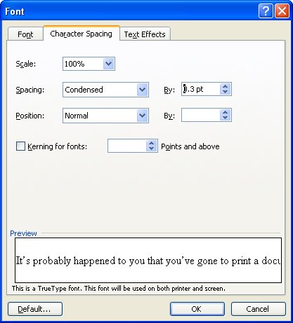
To alter the spacing between characters, select the text to alter and select Format > Font > Character Spacing tab. From the Spacing list box select Condensed and in the By: textbox set the reduced spacing value to somewhere between .1 pt and .3 pt - the results will be subtle but noticeable and your text will look lots nicer.
Labels: character spacing, condensed, Microsoft Word
posted by Projectwoman @ 2:17 PM
0 Comments
-
Links to this post
![]()
![]()

