|
|
||||||||||||||||||||||||||||||||||||||||||||||||||||||||||||||||||||||||||||||||||||||||||||||||||||||||||||||||||||||||||||||||
Microsoft Access - Creating Picture charts and PivotTablesHelen Bradley You might not think of Access as a charting application but it has a neat built in charting feature as well as the ability to analyze data using Pivot Tables.You're probably already familiar with the use of charts in Excel to display information from an underlying spreadsheet, so why not use similar charts in Access? The basics are the same, information is laid out in tables, and Access has a couple of tools you can use to create charts of your data. Prior to Access 2002, you could add charts using the Chart Wizard and create PivotTables but the steps for the latter were cumbersome. From Access 2002 it is much easier and Access now packs added punch by allowing you to create PivotTables and PivotCharts from inside Access. PivotTables and charts allow you to analyse otherwise very complex data in small area and to customise exactly what you see. If you're familiar with using PivotTables in Excel, you'll find they are very similar in Access. If you're not, don't worry, I'll take you step-by-step through the process so you can see how it is done. I'll also show you how to create a PivotChart of your data and how to use the Chart Wizard to add a chart to a form to display information from the current record as you move from one record to the next. This last tool was available in Access 2000 too. Creating a PivotTableTo follow the steps in this column you'll need some data to work with. I've created some simple data in a single table for you to use. This table isn't ideally laid out and, in reality, it would be better to extract the suppliers to a second table, but, for now it has the detail I need and because all the data is in a single place, it's easier to understand. Start Access and choose File, New, Blank Database, give it a name (for example, Products) and click Create. Click the Tables Object and double click Create Table in Design view. Create a database structure that looks like this:
When this is done, right click the ProdID row and, from the shortcut menu, choose Primary Key. Now click the Save button on the toolbar and name your table Product Details and click Ok. Choose the View menu and choose Datasheet view. This is where you'll enter the data for the file. Here is what to type:
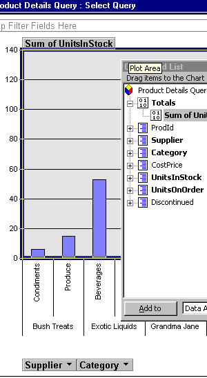
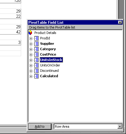
Now you're ready to create your first PivotTable. To do this, with the Table open in DataSheet view, choose View, PivotTable View from the menus. You should see a window called Product Details – Table, with greyed out Pivot table drop areas marked out on it. There should be a list of Fields in another small window (if this doesn't show, click the Field list button on the toolbar to toggle its display). You can now drag items from the field list into various positions on the PivotTable layout. The items you drop into the Filter Fields area behave like items assigned to the Page area in Excel's PivotTables and let you limit the data displayed in the table. For now, don't add anything to the Filter area and, instead concentrate on the row and column fields and the total or details fields. To begin, drag the Supplier and Category fields, one at a time and drop them in the area labelled Drop Row Fields here. Drop Supplier to the left of the Category field. If you get them the wrong way around, simply click and drag them into the correct positions.
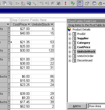
Now drag the CostPrice and the UnitsInStock fields into the Drop Totals or Data Fields here area. You can now have a look at the PivotTable that you have create so far. Down the left of the screen are the suppliers in order and the various categories of goods. Some suppliers supply in all categories and others in only one or two. To limit what you're seeing to, say only Condiments, click the down arrow to the right of Category and select All to clear all categories and click Condiments to select it. Now click Ok to see just the details about Condiment stock on hand. You can then return to viewing all the data by clicking the All option. You can disable the collapse buttons to the left of the supplier names by clicking the Supplier column to select it and click the Properties button. Choose the Behavior tab and disable the Expand indicator checkbox. Add a calculated fieldNow add a field to the PivotTable to calculate the value of the stock on hand. Click the Calculated Totals and Fields button and choose the Create Calculated Detail Field option. A small dialog opens into which you can type the calculation to make. In this case type UnitsInStock * CostPrice and click Change to update the PivotTable. Now you'll see the value of the stock, calculated by multiplying the values in the two fields. You can change the order of this new field by dragging it to the right of the CostPrice and UnitsInStock fields.
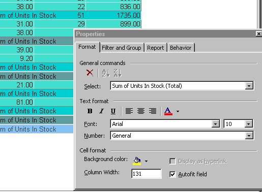
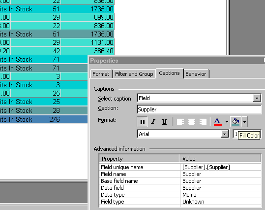
You can also make the heading more descriptive by clicking the column and, from the Properties dialog choose the Captions tab. Type the new column heading title into the Caption area and it will update on the PivotTable. Format a column by selecting it, right click and choose Properties and the Format tab. Use Currency format or Fixed for currency amounts. You can also make the column headings for the columns UnitsInStock and CostPrice easier to read if you click the column, choose Properties, Captions tab. In the Caption area, edit the current caption to include spaces or retype it to suit. Adjust the width of the columns by dragging the column borders between the column headings with your mouse – much as you would change the width of a column in Excel. To remove the Drop area indicators, click the Behavior tab in the Properties window and disable the Drop areas checkbox. You can also create running totals for the information in the PivotTable, for example, for the Stock Value column. Click the column to select it and choose the AutoCalc button on the toolbar and, from the menu, choose Sum. If you view the Field list, you'll see a new totals field called Sum of Stock Value has been added. You can repeat this to add totals for the items in the Units In Stock column by clicking the column heading, then click the AutoCalc button and choose Sum. Save your PivotTableWhen you save your table the PivotTable will be saved with it. As there can only be one PivotTable for this table, any changes you make to it are 'permanent' in the sense that they'll be there when you next open the table and display it in PivotTable view. If you want to use more than one PivotTable view of your data, create a Query and base the PivotTable on the query. To do this, click the Queries button in the Objects list and choose New. Choose Simple Query Wizard and click Ok. From the Tables/Queries list choose Table: Product Details and add all the fields that you want to include in the PivotTable to the Query. Click Next and choose the Detail (shows every field of every record) option. Click Next, type a name for your Query and click Finish. When the query data appears on the screen, choose View, PivotTable and you can now create a PivotTable based on the data returned by the query. Managing PivotChartsPivotCharts are based on PivotTables, if you have one, you automatically have the other. There are step by step instructions in the breakout box for creating a simple PivotChart from a Query. To see how the two are related, with a PivotTable open on the screen, choose View, PivotChart to see the corresponding chart. Likewise, there is a PivotTable automatically created for you whenever you create a PivotChart (simply choose View, PivotTable to see it). Any changes you make to what is included in the PivotTable will affect the corresponding chart and vice versa. In addition to creating a PivotChart based on a simple query like the one shown in the breakout box, you can use other elements in your queries to limit what is displayed in the PivotChart. For example, open the Query in design view (when the PivotChart is on the screen choose View, Design view). Now, in the Category area of the grid, in the Criteria row, type this: [Type product type] Choose View, PivotChart and this will run the query. You'll see a small dialog appear and, into this, type one of the Product categories eg. Condiments and press Enter. You will now see that the chart displays only Condiments which are in stock or on order.
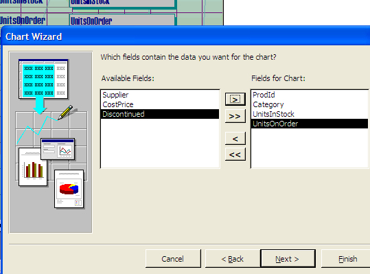
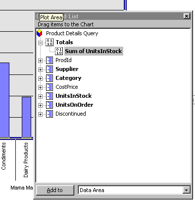
You can also create more complex PivotTables based on tables which are related to each other. Simply create the tables, set up the relationships between the items in the tables and then create a query to extract data from all the tables. You can then create a PivotTable and its associated chart based on this aggregate data. In reality the data I’ve used in this simple exercise should have been created as a database with at least two tables, if not three tables (one for suppliers, one for categories and the third for the main data). The tables should have had relationships set up between them so a query could be created to extract the required data and the PivotTable created based on that data. In this situation I opted to keep the data simple and to set it out so you can see it clearly – and also see how it translates to the PivotTable more easily. Creating a chart on a formAnother way you can display data from your Access database graphically, is to create a chart on a form to display the data from the current record. To do this, you can use the same data that you've been using so far. This time create a very simple form to use with it. From the Objects list choose Forms, click New and choose the Forms Wizard option. From the table list, choose the Products details table and click Ok. Add all the fields from the table to the form by clicking the button with the double chevrons on them. Click Next, choose the Columnar option and click Next. Choose a style and click Next. Type a name for the form and click Finish. When the form appears on the screen, click the Design view button to switch to form design view. Adjust the outer edges of the form to create extra space for the chart to appear in. Choose Insert, Chart and draw a rectangular chart area on the form. When the Wizard appears, choose the Table: Product Details and choose Next. Select the fields to use for the chart – choose the Category, UnitsInStock and the UnitsOnOrder fields as well as the ProdID field. Click Next and choose the type of chart to display – I chose a simple Column chart for this exercise. Click Next and now you can assemble the pieces for the chart.
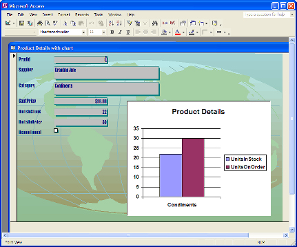
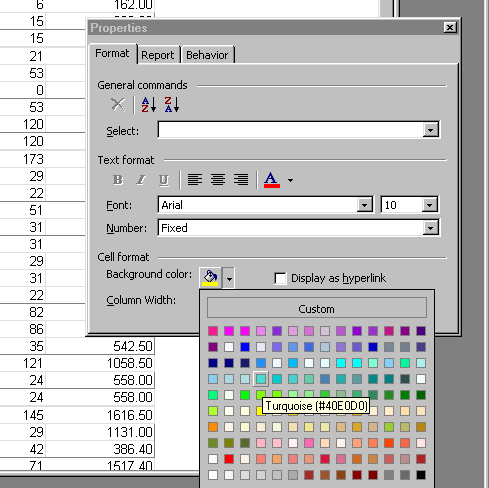
Remove all the existing entries in all the boxes around the chart and start over. Drag the Category field from the left of the dialog and place it in the box under the X axis. Now drag both the UnitsOnOrder and the UnitsInStock fields onto the Data area in the top left of the chart. They will appear here as SumofUnitsInStock and SumOfUnitsOnOrder. Double click each in turn and a small dialog will appear, from this choose None so that the values aren’t totalled. Click Next and the ProdId field should appear in both boxes at the top of the screen. Click Next, type a name for your chart, choose the Yes, display a legend option and click Finish. When you’re done, ignore the look of the chart which appears on the Form in Design view as this isn’t representational of what you can expect to see. Instead, choose View, Form View to view the form. As you move from one record to the next, the chart will display the Category relevant to that record and show the numbers of items in stock and on order. As you've seen there are various possibilities for creating a chart to go with an Access database. You can also add a chart based on an Access table or query to a FrontPage Web and add summary charts to reports, in fact I've just skimmed the surface of what can be achieved in Access. Check the Help topics for more information or check out Microsoft's online Assistance centre at office.microsoft.com/assistance. Format a PivotTable.Once you've created the basics of your PivotTable, you can format it so it looks more attractive and so that the information in it is easier to view and understand. Here are some ways you can select the items to format and the formatting choices you have to use with them: Step 1To format all the category data, for example the numbers of Condiments items in stock for a given Supplier, click on the first item in the PivotTable to select it. From the Format tab of the Properties dialog, choose a pale coloured background colour. Click in the each item in that row and repeat the selection – notice how the format affects each other similar row in the table.
Step 2Click in one of the items in the totals row and repeat the process of selecting a background colour. Make this colour different to the one you selected previously to differentiate these items. Repeat across this row, then set the Overall total for each Supplier to a third colour and the overall PivotTable totals to a fourth colour.
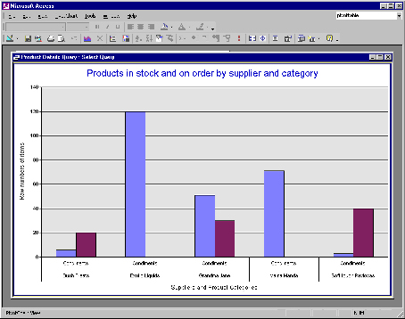
Step 3You can adjust the colour of the titles of the columns and rows by selecting them and use the formatting tools in the Captions tab for the background colour and the font colour. The actual category and supplier names are formatted using the options on the Format tab (select one first as you did the data itself). Create a PivotChartA PivotChart is merely a diagrammatic display of a PivotTable's data and it works much the same as the PivotTable itself. To create one, create a Query to display all the fields in the database as discussed in the text, open the query to display the data and choose View, PivotChart View: Step 1The PivotChart displays much the same layout as you're familiar with from creating a PivotTable. Drag the Supplier and Category fields from the dialog to the Series area. Drag the UnitsInStock field and drop it into the middle of the chart's Data area.
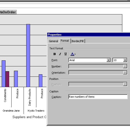
Step 2Repeat this last step with the UnitsOnOrder series and drop it onto the chart. Right click the Axis title element for the X axis and choose Properties. Click the Format tab and type a new title in the Caption area. Repeat this for the Y axis title.
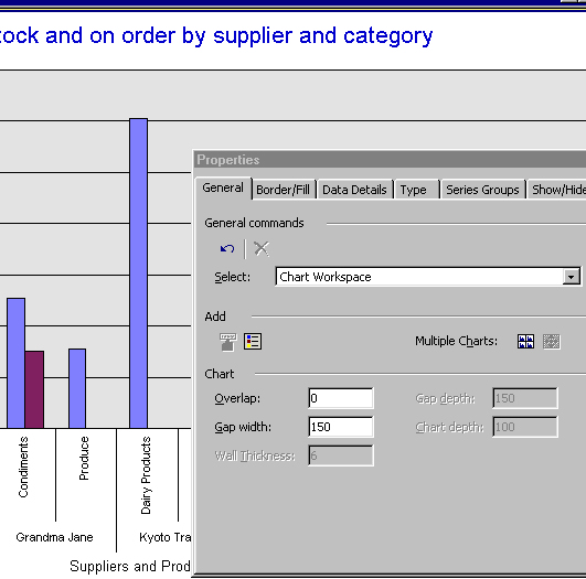
Step 3Click the outside of the chart and choose Properties, Show/Hide to disable features like Field buttons and Drop zones. On the General tab are options for the chart title. Choose the Type tab to alter the type of chart displayed. |
||||||||||||||||||||||||||||||||||||||||||||||||||||||||||||||||||||||||||||||||||||||||||||||||||||||||||||||||||||||||||||||||
|
(c) 2019, Helen Bradley, All Rights Reserved. |