Publisher 2003: flourish effects
Helen Bradley
 Helen
Bradley explains why fonts are sometimes the best image tool you have
for illustrating your publications. Helen
Bradley explains why fonts are sometimes the best image tool you have
for illustrating your publications.
Fashions change in publishing
just as they change in clothes and house decoration. What's hot right
now are flourishes and ornaments which are used as background elements
behind text and, in many cases, over the area where an image and text
elements meet. Here I'll show you how to find and use ornaments in your
Publisher publications.
Before you can use flourishes,
you'll need to find some to use. This is where you may encounter a
problem as you need to have ornaments with transparent backgrounds so
you can see the page background or image through them. For this reason,
your best choice is to use a font which has decorative flourishes and to
work with the characters in the font.
You will find there are plenty
of fun fonts around that contain elements you can use. I like to source
free or shareware fonts and you can find some at this Fortune City site:
www.fortunecity.se/centrum/kungsgatan/177/flowers/flowers.htm – the
ads here are a nuisance but the fonts are worth the effort. Another site
with some good fonts is – 1001 fonts at
www.1001fonts.com/index.html. Check the Dingbat Symbol collection –
I like the KR Fleur range of fonts – there aren't a lot of letters in
any of these fonts but those that are there are good.
Once you've downloaded the
fonts, unzip them and install them using the Control Panel, Fonts tool.
If you have Publisher open, close it and reopen it so the font list will
now show the newly installed fonts.
Find the
flourish character
Finding a character in a font to
use is the next hurdle to cross. One solution is to create a Word
document and to enter into it all the letters of the alphabet in upper
and lower case and the numbers. Copy this text a few times and format
each collection of letters with one of the fonts you've downloaded.
Remove any letters that don't display and save the document. You can use
this as a sampler for sourcing the flourish shapes to use in your
publication. You do this by copying a character to use and then paste it
into the Publisher document.
You can also convert a font
shape to an image by pasting it into your graphics software and then
saving the flourish as an image to use in your publication. When you do
this, save the image as a GIF file and set the background colour to be
transparent so the background won't show on the page.
When you insert flourishes into
your Publisher document you can adjust the layering of the objects by
right clicking the text box or image and choose Order and then one of
the ordering options such as Bring Forward or Send Backward.
Using a flourish in a
publication
Step 1
 Copy
and paste a flourish into a text box in a Publisher document. You will
need to size it very large to see it – do this by selecting the
character and type the size into the Font Size dialog. Use the Format,
Font options to format the character. Copy
and paste a flourish into a text box in a Publisher document. You will
need to size it very large to see it – do this by selecting the
character and type the size into the Font Size dialog. Use the Format,
Font options to format the character.
Step 2
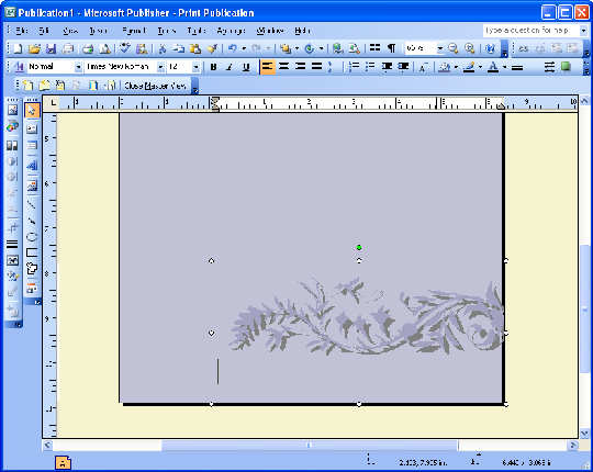
 To
apply a flourish to the background of a page, add it to the Master Page.
Choose View, Master Page and select the Master page. Place the font
character in a text box and format it as desired. It now appears below
any text or image on the page. To
apply a flourish to the background of a page, add it to the Master Page.
Choose View, Master Page and select the Master page. Place the font
character in a text box and format it as desired. It now appears below
any text or image on the page.
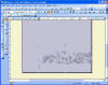
Step 3
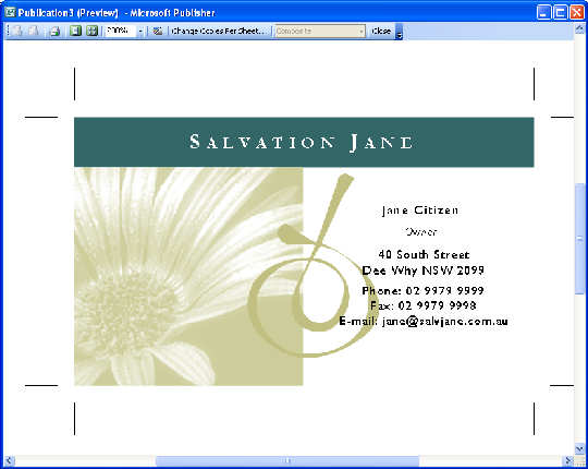
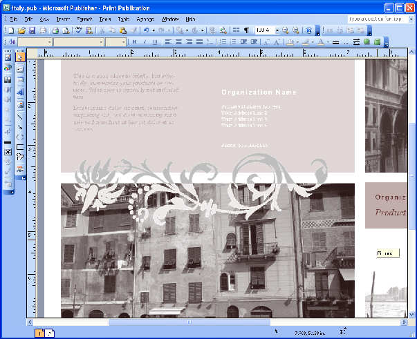
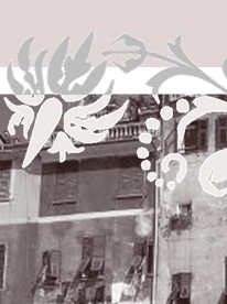
 Create
this effect by placing a flourish saved as an image over the border
between text and an image. Insert the flourish and then duplicate it and
colour each a different colour. Use the crop tool to crop the bottom
half of one image and the top from the other. Create
this effect by placing a flourish saved as an image over the border
between text and an image. Insert the flourish and then duplicate it and
colour each a different colour. Use the crop tool to crop the bottom
half of one image and the top from the other.
Article first published in Australian PC User
magazine
(c) Helen Bradley 2007-2009
|